Grace Coenraad

Grace Coenraad, Untitled, micron, sharpie, graphite, and india ink on paper, 2015, 16" x 16"

Grace Coenraad, Untitled, micron, sharpie, and india ink on paper, 2015, 22" x 22"

When I first painted a number of canvases grey all over (about eight years ago), I did so because I did not know what to paint, or what there might be to paint: so wretched a start could lead to nothing meaningful. As time went on, however, I observed differences of quality among the grey surfaces – and also that these betrayed nothing of the destructive motivation that lay behind them. The pictures began to teach me. By generalizing a personal dilemma, they resolved it.
           Gerhard Richter, From a letter to Edy de Wilde, 23 February 1975


Coenraad’s dark, minimalist works are the product of a measured and slow process, executed with extreme diligence. Using 08 black microns, traditional pen and ink nibs, and occassionally graphite, she densely hatches careful lines, which slowly collect on the surface over many hours of work. This method is a clear path leading to an absolute resolution - the surface being obscured by black. The magic of these pieces (although they’re inextricable from the story of the steadfast execution of this simple method) lies in content that’s fantastically nuanced and complex. The black square is a subtle, jagged field comprised of various sheens and tones - certain patches are tinted by an initial application of bright watercolor (often pink or blue) that has bled through the subsequent, inevitable layer of black. The marks made using microns are incised, and those created with india ink and nib lift the paper slightly away from the surface, resulting in a textured surface reminiscent of Richard Serra’s black oil stick drawings. And much like the reductive, sublime paintings of Richter or Clyfford Still, Coenraad demonstrates that the honest act of mark-making isn’t reduced when it’s stripped of intentions or illusion. Conversely, it only becomes more revealing and mysterious. 

After his first museum exhibition of entirely black drawings in 2011, Richard Serra was described by critic Roberta Smith as hermetic, abstract, difficult, and austere, an assessment that he accepted, describing it as “a virtue.” Explaining that art has to be difficult, Serra said that drawing independent of the flamboyance of color interaction, mark-making on its own, in black on white, proves to necessitate invention, thereby providing a “subtext” for how an artist thinks. For him, allover black works were a move to escape that convention of drawing as a “form to ground problem” to create works concerning “interval and space” rather than image.*  

Coenraad didn’t stumble upon this principle inadvertently like Richter; for her, it’s a process that reflects a way of being. It is, as Serra articulates, an extension of the thought process and more. To a degree that’s rarely seen for non-performative artists, Coenraad is an artist for whom the boundary between life and art is blurred. Every task is executed with the same resolute sensibility, engaging life with a singular and sophisticated method in pursuit of perfection. Every bite of food is carefully selected and examined before being eaten (ingredients of an undesirable color rejected), every mundane task is afforded great consideration. For years she has worked part-time at a document destruction facility, where no one has been able to compel her to obliterate more than one document at a time. At home, blackening crossword puzzle squares for hours with ballpoint pen or sharpie is part of her daily ritual.  

In the studio, Grace is fully immersed in her practice - working with her face close to the surface, she becomes absent from anything exterior of the drawing process. Occasionally she will stop and look around the room for a moment like a deep sea diver rising briefly to the surface, before submerging again. Grace doesn’t discuss her work, not because she can’t, but because there seems to be nothing necessary to say once a piece is finished. 
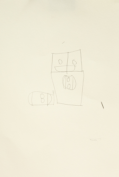
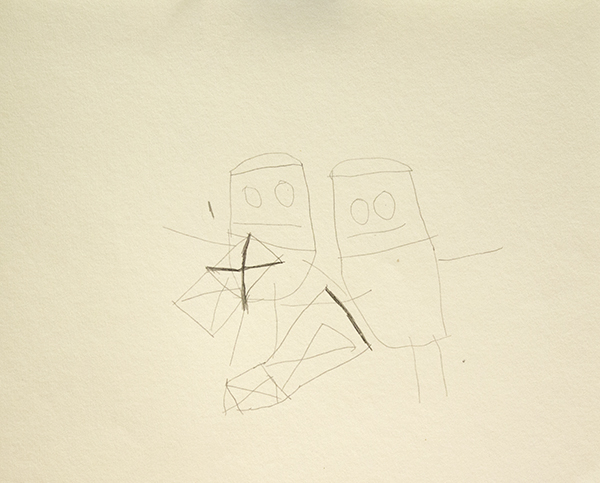
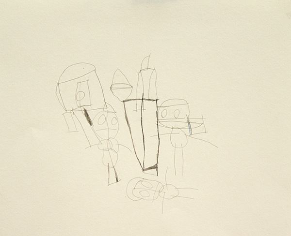
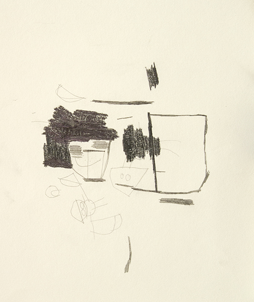
Between her larger, long-term works, Coenraad sometimes creates small graphite sketches,  thoughtful experiments that serve as a point of entry into her mysterious thought process. The placement of faces demonstrate the dynamics of orientation in her drawings. The coexistence of elements in combination with turning the paper many times while working isn’t incidental to the process, but essential to it.

Coenraad is a Juneau-based artist who maintains a studio practice at The Canvas in Juneau, Alaska. Her work will be included in an upcoming group exhibition curated by Disparate Minds writers Tim Ortiz and Andreana Donahue at The Canvas' exhibition space in December.
John Hartman

assorted letter openers

Three Geese on Stands, Pine and Cyprus

owl sculpture, mahogany

Material in the raw is nothing much. Only worked material has quality, and pieces of worked material are made to show their quality by men, or put together to so that together they show a quality which singly they had not. “Good material” is a myth. English walnut is not good material. Most of the tree is leaf-mold and firewood. It is only because of workmanlike felling and converting and drying and selection and machining and setting out and cutting and fitting and assembly and finishing - particularly finishing - that a very small proportion of the tree comes to be thought of as good material.
    - David Pye, The Nature and Art of Workmanship

John Hartman skillfully works within the tangible, tactile boundaries of a small-scale process and commitment to good workmanship. Within this intimate context, he engages wood without conceptual boundaries, exploring utility, mimesis, and sculptural invention freely. Through the tradition of woodworking, Hartman is able to realize a wide range of possessable objects that evoke a sense of elegance and great integrity.

Hartman is a Manhattan-based artist who has been working in Pure Vision’s studio since 2013. From Pure Vision: 

Hartman’s “main passion is woodcarving. John was introduced to the craft at the age of eleven, in wood shop at The Rudolph Steiner School. He began by crafting a cherrywood flour scoop. Instantly drawn to the medium, he slowly started teaching himself how to make more complicated objects. Collecting rare woods from around the world such as ebony, zebra wood, Philippine mahogany and bloodwood, John now spends hours in the studio and at home carving, whittling, sanding and polishing each piece. Inspired by visits to his family’s seaside home on Fire Island, his subjects often reference birds and sea creatures.” (more)

Yasmin Arshad

Untitled, marker on paper, 22" x 30"

129999, marker on paper, 22" x 30"

Untitled, marker and acrylic on wood, 19.5" x 19.5"

Untitled, marker on paper, images courtesy Gateway Arts

Untitled, marker on paper, images courtesy Gateway Arts

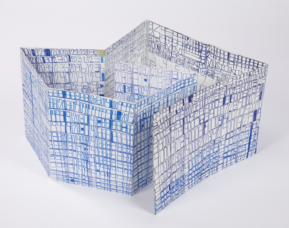
Arshad’s distinctive works are characterized by series of numbers, phrases, and concepts of time that manifest in the form of visual and spacial poetry. An investigation of the overlap in the process of seeing and reading akin to Christopher Wool is present - where Wool employs the arrangement of words on a surface to disrupt the reading process systematically, Arshad’s visual and written languages instead merge more fluidly. Text forms, influenced by dynamics of color and scale, impose elusive and subjective variation in the reading experience.

Arshad’s work reflects an avid interest in ideas related to the passage of time. An invented symbol for eternity, 129999 (a single number indicating all months and years), often surfaces in her work; she also lists years chronologically beginning with the year 2000, organizing the numerical information into multi-colored grids. Over the course of 46 years, Roman Opalka painted horizontal rows of consecutive, ascending numbers (1 – ∞), an ongoing series that ultimately spanned 233 uniformly sized canvases. In “Roman Opalka’s Numerical Destiny” for Hyperallergic Robert C. Morgan writes:

From the day his project began in Poland until his death in the south of France in 2011, Opalka combined clear conceptual thinking with painterly materials. His search for infinity through painting became a form of phenomenology, which, in retrospect, might be seen as parallel to the philosophy of Hegel. Through his attention to a paradoxically complex, reductive manner of painting, Opalka focused on infinite possibilities latent within his project.

Arshad’s rigorous, repetitive approach is similar to 0palka’s engagement with infinity, yet there are more prevalent breaches in her pattern-based system. Much like the process of weaving, Arshad’s drawings reflect an intrinsic structure that serves as a guide for intended visual results, yet there is room for distortion and a spontaneous response to the surface.

Arshad (b. 1975, Florence, Italy) has exhibited previously at Cooper Union (NYC), the Outsider Art Fair, The Museum of Everything (London), Phoenix Gallery (NYC), Berenberg Gallery (Boston), Trustman Gallery (Simmons College, Boston), Drive-By Projects (Watertown, MA), Creativity Explored (San Francisco), and at Gateway’s Gallery in Brookline, Massachusetts. Arshad lives in Cambridge, Massachusetts and has attended Gateway Arts’ studio since 1996.              

see more work by Arshad here


Luis Hernandez

Untitled, marker on vellum, 8.5" x 11" 2015

Untitled, marker on vellum, 8.5" x 11" 2015

Untitled, marker on vellum, 18" x 24" 2015


We were fortunate to meet Luis Hernandez at a turning point in his creative practice, as he was beginning this body of work, a series of marker drawings on vellum. Aesthetically, they’re exciting abstractions; energized and vibrant, each complex composition is perched between intuitive and systematic visual ideas. Hernandez's work effortlessly achieves what many contemporary artists currently investigating abstraction strive to, with the re-emergence of a Twombly-esque aesthetic.

Observing Hernandez in the studio, it's impossible not to feel a sense of wonder at the mysterious and dynamic nature of his prolific creative process. The contrast of expressive and systematic qualities in his work is mirrored in his disposition, which is that of an extremely earnest and affable man, with a great aspiration to speak directly and connect with the world beyond himself, but whose way of thinking and seeing is fantastically disparate from that of his neurotypical peers.  

Because of his aspiration to communicate clearly, he was slow to fully embrace his instinctive practice and still sometimes strives to create representational work. When he attempts to draw from life, however, he’s never satisfied. During these moments, as he discards page after page of a sketchbook, the singularity of his experience is most clear as the renderings even he finds most successful have no obvious visual relationship to their subject. Once, an observer sympathetic to his frustration tried to assist by providing a dotted line as a guide; he has since adopted the dotted line, applying it to his abstract forms as though he can achieve a magical quality of objectivity from its presence.

In this body of work, Hernandez has described his process of drawing as moving along or searching for a path. If it’s a path, then it’s one he follows with great vigilance, a quality that he values deeply. His vigilance is a matter of faith, an inherent knowledge of the world that he believes in with great conviction; this is sometimes expressed in terms of his Tlingit heritage (referencing conversations in dreams with his ancestors or communications with Eagle or Raven) and at other times in drawing comparisons between himself and his idol, the ever vigilant Walker, Texas Ranger.

Hernandez maintains a studio practice in Juneau, Alaska at The Canvas; work from his current series will be included in an upcoming group exhibition curated by Disparate Minds writers Tim Ortiz and Andreana Donahue, which will be on view at The Canvas’ exhibition space in December.

drawing in progress in the studio 


Harold Jeffries


Harold Jeffries, an artist at Center for the Arts (Little City) in Illinois (who was featured in the documentary Share My Kingdom) refers to these drawings as “blueprints for heaven.”  As that phrase suggests, these works engage a complex creative space between the expression of narrative and a genuine concept of mystical utility. It is clear that for Jeffries these works are not merely drawings or paintings - they are acts part of a separate world, whose process includes finishing each work by drawing an elaborate phantom drawing for that unseen realm with his pen inches above the surface. Center for the Arts’ Frank Tumino elaborates:

"Harold Jeffries’ imagery and working methods are an outgrowth of his personal obsessions and inner world.  Nearly every piece has as its basis a gridwork of lines, forming squares, rectangles, circles and other forms which resemble an isolated section of a vast blueprint outlining some lost Minoan palace.  If asked, Jeffries will tell you that these are indeed blueprints.  They are part of his lifelong obsession to create blueprinted plans for Heaven.  This project has no beginning, middle or end.  The portion of the plans that Jeffries draws at any one time simply reflects his thoughts at that moment, and do not advance the project along any conceivable timeline, a fitting solution for planning what is infinite and eternal.  
 

The technique of layering, be it of forms, media, or concepts, is another hallmark of Jeffries’ art.  Resulting in images which appear to be wholly abstract, Jeffries will sometimes layer additional media over his original blueprint drawings.  He will alternate drawing media with washes of paint, obscuring the original blueprint in one spot, reemphasizing it in another, drawing new plans on top of it in yet another place.  Sometimes all or part of the original drawing is overlaid with a tight mesh of faces and human forms.  These are variously described by Jeffries as ghosts, or spirits, or voices.  To him they are real, and they give the viewer an arresting glimpse of Jeffries waking life.


On occasion, Jeffries has taken his blueprints and worked them into 3-dimensional form.  Harold is extremely interested in the use of construction materials.  This fascination is evident in the decisions he makes to bring his ideas to reality of form.  He prefers to reuse discarded materials like empty bottles.  The act of building becomes a metaphor for Harold’s life and his sense of the world.  He finds comfort in the idea that something both beautiful and useful is being created while the burden that would otherwise have been placed upon existing landfills is reduced." (More)

Roger Swike

This piece, from the collection of Disparate Minds writer Tim Ortiz, is a work by Roger Swike of Gateway Arts in Brookline, Massachusetts (the oldest progressive art studio we know of, founded over 40 years ago). 

A collection of drawings created at different times and then deliberately assembled by Swike into a folder, it's an assertive, endearing proposition about what an art object can be. Each time Swike's lexicon is revisited, it presents an opportunity to rethink its nature - possibly an archive, message, map, poem, or something else entirely.

Within what initially appears chaotic, familiar text referring to the exterior world is everywhere. Black and blue ballpoint pens and ten colored pencils are used as though each tool has a symbolic role. Some ideas are organized neatly into grids, others are written, and everything written in multiple layers of ballpoint pen. Over time, subtle patterns emerge, such as references to the number 7 or numbers listed on their own counting down from ten (but when listed alongside the alphabet they ascend from 0 to 9).

Because the piece is disciplined and systematic, it's tempting to strive to understand a rigid system that defines it, but the true nature of the work seems to reside in the plasticity of its rules. A grid listing Loony Toons characters breaks pattern to include "YOSEMITE NATIONAL PARK SAM DONALDSON", numbers written in black pen without an overlapping of blue pen, yet the sequence and grid are still drawn using the ten selected colors…often it feels as though Swike isn't creating the system, but instead exploring it as a poet does language, both fluent and curious.

Edward Haswood

Edward Haswood, an artist who has been working at Hozhoni Artists in Flagstaff, Arizona since 2007, was able to meet with us to discuss his work during our studio visit last year. Storytelling, he explained, plays a crucial role in his work, citing his grandmother’s storytelling as an important influence. His dynamic body of work, which includes portraits and symbolic imagery, (as well as more complex narrative works) reference stories derived from merging mythologies of his native heritage (both Navajo and Hopi), his life experiences, and imagination. 

Like many of his colleagues at Hozhoni, Haswood is doubly prone to being relegated into the “outsider” genre, as an artist who is both Native American and experiencing disabilities. Given this disposition, it's interesting that while Haswood's work bears little in common with either Outsider Art or traditional Native American art, it has an immediate aesthetic similarity (particularly in terms of color and design) to the work of contemporary Native American artists such as Wendy Red Star and John Nieto.

Kenya Hanley

Untitled, mixed media on paper, 9.5" x 9", 2014

A Lunch, mixed media on paper, 14" x 9", 2015

Kenya Hanley's works on paper have the feeling of both aspiration and interpretation. Bold, decisive drawings describe a world of abundance, encoded in color and imagined connections between realms of fiction and reality. Hanley works at LAND Gallery, a progressive art studio in the heart of DUMBO, Brooklyn, one of the premiere art neighborhoods in New York. From Land:

"Kenya’s work has been the subject of an exhibition at the flagship J Crew store on Madison Avenue, and the work has since become part of J Crew’s corporate collection. Kenya’s work also figures prominently in the collection of The Museum of Everything in London as well many private collections throughout the United States." (See More)

Thomas Sedgwick

Thomas Segwick, in pen on paper, composes images that feel constructed as opposed to drawn, achieving a robust depiction of mass and form with simple outlines. Sedgwick is represented by DAC Gallery, the exhibition space for the progressive art studios operated by the Los Angeles Exceptional Children's Foundation. From DAC:

"Thomas Sedgwick's line drawings are rendered as abstract grids reminiscent of maps, essentially acting as blueprints for his eccentric imagination. At the heart of his images, he depicts the desire to build, plan and create a fantastic world..." (more)

John Patrick McKenzie

John Patrick McKenzie has been working at Creativity Explored in San Francisco since 1989; we were able to meet him briefly during our tour of the Creativity Explored studio last year.  He's has an exceptionally reserved and focused character, and didn't allow our visit to distract his attention away from a methodical and specific preparation of his work-space. McKenzie's works on paper are the perfect expression of a wonderfully inventive sense of humor that couldn't be expressed otherwise. His text, color choices, repetition, and occasional incoherence all contribute to a poetic charisma that is profoundly endearing.  From Creativity Explored:

"Swirling, multi­angled, and disorienting, the placement of his language comments on the contradictory, sometimes overwhelming, nature of media attention and celebrity.  McKenzie’s original script and arrangement of text are tactile examples of his interpretation of the world, and can be both hilarious and poignant. " (more)

Jeff Larabee

Marker on panel, 2015

Marker on Cardboard, 2015

Marker on panel, 2015

Over the course of working in and researching progressive art studios, we’ve encountered many artists who brilliantly incorporate text into their work: the narratives of Oscar Azmitia, rules and records of William Tyler, Daniel Green’s stream of consciousness lists, among many others. Text is usually employed by these artists in creative pursuits because it’s the paramount mode of expression and there’s often no separation between studio practice and daily life. This tendency may be the result of art-making as the most significant form of communication -  a disposition which many artists lay claim to, but few truly experience in such a literal and profound way. 


We’ve recently had the privilege of getting to know Jeff Larabee, a Juneau-based artist working at The Canvas, an integrated studio in Alaska. These grayscale, marker on panel and cardboard pieces (whose surfaces are wholly devoted to hand-written text), are selections from a recent series. The incredible aspect of Larabee's work is that it’s more fully about written language than the artists mentioned above, despite it being unavailable to him as a tool to communicate. 


It’s important to understand that these works aren’t created through an intuitive or automatic process. Larabee always works from a reference - transcribing found newspapers, books, pages of printed text, and often his previous works. Larabee gathers newspapers and carries them with him; he fills in crossword and sudoku puzzles then blacks them out with ballpoint pen, examines articles and classified ads, then blacks them out as well. The process of studying and engaging with newspapers sometimes occupies the majority of his studio time. The romance of his work resides in a study of text akin to the investigation definitive of the work of Tom Sachs, who refers to his process as a form of Sympathetic Magic (the desire to imitate or recreate something whose true nature is unattainable). Sachs explains:


“...when someone like an Aborigine person in New Guinea will make a model of a refrigerator because they saw that missionaries had refrigerators and food was always coming out of them. They made these models of refrigerators, and they would pray to them and hope that food would come out. And they’d even make runways with the hope that airplanes would land on them and docks with the hope that ships would come visit them. In fact anthropologists did come to look at these makeshift docks, and runways, and fridges. So the Aboriginal people, in a way, created their own destiny using art.”  (http://www.somamagazine.com/tom-sachs/)


In the same way that Tom Sachs uses intensive study and mimesis to access NASA’s Space Program, Larabee strives to access the written word. Larabee doesn’t experience written language as a literate person does, but experiences, values, and diligently engages with it in his creative practice and daily life. This body of work aspires to the concept of encoding and transmitting information in a purely magical sense, rendering visible to us what is unseen within the text - an aesthetic and conceptual investigation of letters and words, separate from a concrete concept of meaning. 

Marker on panel, 2015


From a distance these drawings are alluring - stark, clean, and curious, with the promise of an elaborate message. Up close, they provide no message, but are surprisingly labored and nuanced, revealing ghosts of marks wiped away, shades of grey, and repeated, overlapping letters that build history and depth. In the absence of meaning, the accumulated hand-written forms are strikingly personal. Larabee, uninhibited and confident, ultimately leaves nothing between the viewer and his hand, as if the act of mark-making itself carries the power of the written word. 


Although he’s rarely willing to discuss his work, Jeff (an avid Batman fan), has referred to these pieces as “letters to Gotham City.”


Michael Oliveira

Michael Oliveira works at the oldest progressive art studio in the US, Gateway Arts in Brookline, Massachusetts.  Oliveira's heavy lines and bulky forms are built up fastidiously over time using very fine point pens, creating a fantastic surface that's difficult to capture in photographs. 

"...born in 1978 in Cambridge, Massachusetts, and has been working happily at Gateway since 2000. He creates embroideries and pottery, but mostly loves making very stylized drawings which he carefully constructs using paint markers and sharpies. His subject matter includes a portrait series of Gateway artists who have passed away." (more)

Tripp Huggins

Tripp Huggins explores the drama of geopolitics in artist books of expressive graphite and crayon drawings. Huggins works at an excellent progressive art studio in Cincinnati, Ohio, Visionaries and Voices

"Tripp Huggins tells it like it is. The death of President Kennedy, WWII and The Cold War, Stories from the Book of Exodus, are the subjects of Tripp’s narratives. Drawn with pencil and wax crayon, which he prefers because it looks most real. His drawings are a commentary on the world we live in and moments in history." (see More)

Helen Rae

Untitled, colored pencil/graphite, 26" x 20”

Recent Drawings, at The Good Luck Gallery in LA, is a beautiful collection of colored pencil and graphite works on paper by Helen Rae. These drawings live in a space between the realms of representation and abstraction, most often realized as figures surrounded by ambiguous, pattern-driven environments resembling textiles or foliage.

Untitled, colored pencil/graphite, 26" x 20”

 
Rae’s incredible abstractions aren’t merely expressive, stylized reimaginings of found photos and magazines; each drawing seems to engage and elevate its source image with drive and ambition. Rae seems to search through the image, read it like a rich text, and celebrate every passage - the shadow of a frame against the wall, heel of a shoe, zipper on the side of a bag, are all described with incredible detail and conviction. Inevitably, the figures and faces remain expressive and bold, even as they’re nearly lost in a cacophonous ecstasy of patterns.

Lucien Freud said that “...truth has an element of revelation about it. If something is true, it does more than strike one as merely being so...” In exactly this sense, Rae’s works are undeniable revelations. The impact of the clean, uniform installation is vibrant and specific, further emphasizing the singularity of each drawing. 

Much like LA-based artist Eric Yahnker, Rae explores the limits of the often overlooked and rarely mastered medium of colored pencil. These achievements are the direct result of engaging in an uncommonly committed creative practice. Rae has been a studio member of First Street Gallery Art Center since it’s founding in 1990 - First Street’s Seth Pringle asserts, “Helen's focus and dedication in the studio are unmatched. She rarely misses a day and when she's in the studio she's always working diligently. The style and execution of her drawings have slowly but steadily evolved over the course of her 25 year career, growing in compositional complexity to its current state of mind-boggling beauty and intensity.”

The Good Luck Gallery is currently the only commercial exhibition space in Los Angeles devoted to self-taught artist programming. Owner Paige Wery was previously the publisher of Artillery, a contemporary art publication based in LA, for six years before opening the exhibition space in 2014. Wery became familiar with Rae’s work during an initial First Street Gallery studio visit; several people had suggested that she visit their location in Claremont, California due to the quality of art being produced under their long-standing, excellent program. Rae’s show has been wildly successful, selling out early and generating a waiting list for new work.

Untitled, colored pencil/graphite, 26" x 20”

Over the past several years, interest in the work of self-taught artists (historically referred to as Outsider or Visionary artists) has gained momentum as the contemporary art world becomes increasingly pluralistic. Wery remarks, “It’s very exciting to see the attention that Outsider Art has received over the last few years. I give huge credit to Massimiliano Gioni, who included outsider work with contemporary work at the 2013 Venice Biennale. I think that made a huge difference. The fact that contemporary fairs are including my program and other outsider galleries is a sign that things are moving in the right direction. Museums are showing and accepting Outsider Art into their collections far more often. I’m proud to have joined the champions furthering the exposure and dialogue of self-taught art. The conversations with collectors, artists, dealers, and casual visitors about self-taught art has been extremely encouraging. It seems the art being shown and the dialogues taking place at The Good Luck Gallery are already making a difference.”

Rae’s work has been featured previously in various exhibitions in New York, Boston, Washington D.C., Scotland, Belgium, Japan, and extensively in California. Rae has been based in the Claremont area since 1938.


Helen Rae: Recent Drawings
April 18 - May 16, 2015


The Good Luck Gallery
945 Chung King Road (Chinatown)
Los Angeles, CA 90012
Wednesday – Sunday
Noon – 5PM and by appointment

Evelyn Reyes

Salmon Carrots, oil pastel on paper, 2010

Orange Carrots, oil pastel on paper, 2009

Brown Carrots, oil pastel on paper, 2009, all images courtesy Creativity Explored Licensing

Brown Carrots, oil pastel on paper, 2009, all images courtesy Creativity Explored Licensing

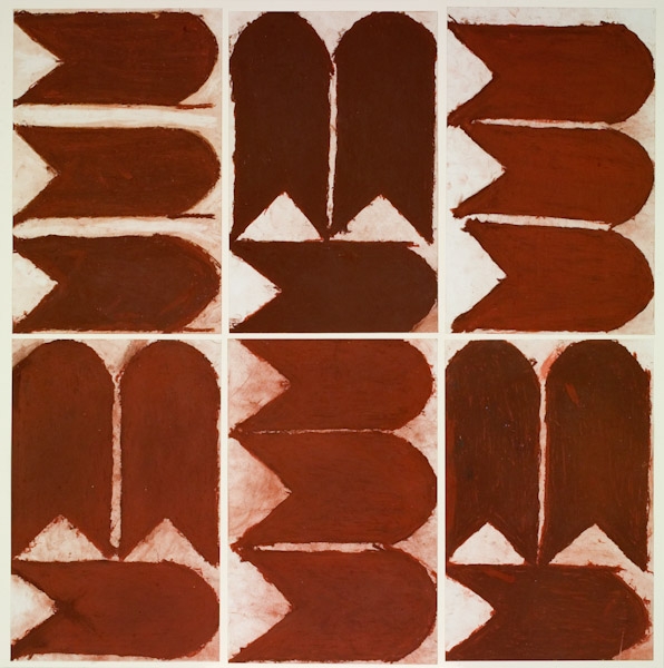
Evelyn Reyes has been creating powerful and minimal oil pastel drawings like these at Creativity Explored in San Francisco since 2002. The conviction and ritual apparent in her extensive series of works is definitive not only of her creative practice, but also her way of being; from Creativity Explored's website:

"Reyes’ art practice mirrors the repetition and order that are central to her daily life. Reverence for each aspect of the process defines her art practice. It begins with the selection of a piece of specifically sized paper. Next, the particular shade of oil pastel is chosen, the forms outlined then filled with a thick impasto. The finished piece is carefully examined, cradled in her arms, and taken to certain cardinal points in the studio. And finally, there is the ceremonial clean up and storing away of the completed work." (see more)

Reyes' collaborations with Bay Area artist Sarah Thibault will be included in Creativity Explored's upcoming exhibition Super Contemporary.