Patrick Hackleman is an artist based in Corvallis, Oregon (near Portland), best known for his highly detailed diagrams and models of ships which strive to improve on historical designs, reaching backwards in time with a humanity and romanticism to avert disasters long past...
Read MoreHoliday Giving - Supporting Disability Rights
William Britt, Untitled, oil on board, 21.4" x 27.4", 2010, courtesy Pure Vision Arts
Since our recent post-election essay regarding art and disability advocacy, we've received several inquiries about supporting disability rights and national organizations that are working for this cause.
First and foremost, your local progressive art studio is a great place to start; the progressive art studios listed in our directory are primarily small non-profits that depend on the support of their local community to exist. Donating directly to these organizations, attending exhibitions, and buying artwork are great ways to support these studios and this important work. Going to these programs with discerning criticism, and finding works of art that you love to collect and live with is a powerful way to integrate disability (disparate thinking) into your life in a manner that’s personal and authentic. If there’s a progressive art studio in your community, you will almost certainly find that some of the most original and authentic art being made locally is being created in that studio and is remarkably affordable.
Apart from progressive art studios, there are many organizations throughout the country that provide services, research and education, or public policy advocacy. It's often difficult to differentiate between which organizations to endorse and support, because they sometimes espouse regressive ideas and practices. Philosophically, there are many areas where advocates are far from a consensus, and worse, there are non-profits that are actually exploitative; researching an organization's mission and history beforehand is vital.
Two important measures of the quality of a disability service or advocacy organization are:
- How prominently disabled individuals, their ideas, and voices are included in the organization's composition, message, and presentation
- How prominently the organization focuses on inclusion, acceptance, and support services, as opposed to prevention, intervention, or “cures”
Andrew Hostick, A Million Single Moments, colored pencil on mat board, 14" x 11", 2013, image courtesy Visionaries + Voices
Our recommendation on a national scale is to direct your support to an agency advocating for disabled people that is a paragon of these principles and an ideal example of what a disability advocacy effort should embody: the Autistic Self Advocacy Network.
Although ASAN’s foundation is specific to Autism, they’re the most progressive disability rights agency of their type and scale in the country that we’re aware of - by and for disabled people, an essential principle expressed in their slogan “nothing about us without us.” Co-founded by dedicated advocate Ari Ne’eman, it’s a fantastic resource for detailed information and news regarding disability advocacy. Donations to ASAN will support public policy advocacy, and disability advocacy education that you can trust to serve the needs of the disabled.
“ASAN advocates specific policy positions on issues of importance to Autistic people and others with disabilities. In so doing, we seek to ensure the meaningful involvement of Autistic individuals in making policy at all levels, to promote a culture of inclusion and respect for all, to enforce the rights of Autistic people to equal opportunity at school and at work, and to improve funding for community services and supports along with research into how they can best be provided.”
Another great project to support is the Disbability Visability Project:
Whereas ASAN focuses on affecting policy, the Disability Visibility Project focuses on activism, media, and affecting culture by publishing stories and organizing conversations - a fierce and ambitious effort to place disability voices at the forefront. Founder Alice Wong explains:
A Conversation with Sophia Cosmadopoulos
Cosmadopoulos is currently a coordinator and facilitator at LAND Studio and Gallery, a progressive art studio provided by the League Education & Treatment Center in DUMBO, Brooklyn. Her valuable perspective is also informed by an uncommonly dynamic career in this field...
Read MoreAlan Constable
Alan Constable has been creating and exhibiting work in various media for the past thirty years, including painting and drawing, but it is the extensive body of ceramic works he has formed over the past decade that has increasingly garnered attention and acclaim...
Read MoreDisabled Artists Show Us a Way Forward Against a Trump Adminstration
The rise of Donald Trump over the past year has been for us, like many, a growing dread - not wanting to believe that America would really elect an unfit candidate, while watching both political parties and the news media self-destruct in the face of a changing world....
Read MoreDale Jackson at White Columns
Dale Jackson at White Columns presents a significant selection from the Cincinnati-based artist’s extensive body of work for his first New York exhibition. Brimming with a disarming sincerity and candor, Jackson’s imaginative missives are a breath of fresh air...
Read MoreSusan Te Kahurangi King: Drawings 1975 - 1989
Susan Te Kahurangi King’s current exhibition marks her second, highly anticipated solo show at Andrew Edlin, following the critically acclaimed debut of the New Zealand-based artist with the space in 2014, Drawings from Many Worlds. Known for her vibrant and frenetic biomorphic abstractions, Drawings 1975 - 1989 curated by Chris Byrne and Robert Heald features a lesser known series from her prolific and consistently impressive practice...
Read MoreThe Eloquent Place: Harald Stoffers and Josef Hofer at Cavin-Morris Gallery
Harald Stoffers, Brief 163, 2010, Waterproof felt tip pen on cardboard, 39.375 x 27.5 inches
The Eloquent Place is a powerful exhibition featuring intimate works on paper by Harald Stoffers and Josef Hofer, currently on view at Cavin-Morris in NYC. In a compelling pairing of these artists Cavin-Morris proposes:
Both artists seek to establish a sense of internal and external Place by creating worlds that unfold within and around their own bodies. The act of drawing is a method of controlling survival; in Hofer's case figuratively, and in Stoffers’ case by emotionally charging the written words with visual intensity. For both the art becomes a conduit toward a way of balance and self-placement in the world.
The dialogue between the two bodies of work results in a rich commingling of concepts and earnest explorations of representation versus abstraction through drawing. The opposition of systematic processes with highly personal subject matter reveals a strong connection between the work of Stoffers and Hofer, while exposing a candid vulnerability.
Josef Hofer’s partially clothed and fully nude figures originated as self-portraits drawn from memory of his reflection in a small mirror (with a substantial, ornate wooden frame) placed on his bedroom floor. The priority of his images resides in the recollection and expression of sections of the body, connections of limbs and folding flesh - not reflecting a moment in time or visual representation of the figure, but rather a narrative of observation. He captures a series of moments spent noticing the body, which is then recalled as drawing. Abstract of the obfuscating influence of rendering, likeness, or proportions, Hofer’s marks are naked as they describe the truncated contours of the body he recalls.
An important element included in every portrait, is the frame around the perimeter of the drawing surface (always alternating in bands of orange and yellow colored pencil, outlined in robust graphite). Speculations surround the origin or purpose of this frame; it's generally understood as a depiction of the frame of Hofer’s mirror, although it’s included in every piece, not just the drawings featuring figures. Hofer doesn’t discuss or explain his work since he’s primarily non-verbal - ultimately the genesis and nature of this device remains unclear.
It is certain that, much like its presence in Martin Ramirez’s drawings, the frame is an integral element and not merely a decorative one; Hofer has included it consistently since 2003, though in various iterations. Created slowly and deliberately (as evidenced by the labored impressions of his blunt implement), the frame often becomes quite elaborate and is even more time intensive to develop than the current variation of figure within. Elisabeth Telsnig, who worked with Hofer (at the creative program he attends) in Ried, Austria from 1997 until recently, states, “He draws a figure again and again, looking for ‘the perfect figure’, ‘the perfect position’. Only, when he has the impression, he has found it, can he stop the series. He seems to like to to be under constraint.”
The drawing of the frames is formally opposite to that of the figures (using a straight edge) and bound by consistent rules across all of his works - always orthogonal (even when they evolve to deviate from the rectangle of the perimeter) and meeting at a diagonal, as a frame does.
It's important to notice the use of a straight edge by an artist whose figures are drawn in such a personal way, in which his hand is exposed. The use of a mechanical tool or process to contrast with (or justify) this exposed hand is almost universal throughout art history. From the explicit use of geometric and mathematical rules to restrict the influence of the artist’s voice in catholic iconography, to JMW Turner’s bits of architecture providing an armature for an ethereal expression of light and air, to Gerhard Richter’s squeegee obscuring his hand-painted marks. Chuck close’s grids, Gabriel Orozco’s checkered patterns, the frame itself, or the smooth white walls of a gallery space all strive to achieve the same end as a pencil guided along a straight edge - respite from the expressive responsibility of mark-making, submission to something sure, inert, and objective. In Hofer’s work these methodical choices build inward towards his figures, sometimes working their way around, completely enveloping them. The interactions of these opposing processes is a highly original visual and procedural poetry.
Josef Hofer, Untitled, 2007, pencil and colored pencil on paper, 17.32 x 23.62 inches
Josef Hofer, Untitled, 2014, Pencil and colored pencil on paper, 19.69 x 27.56 inches
Josef Hofer, Untitled, 2005, Graphite and colored pencil on paper, 17.32 x 23.62 inches
Josef Hofer, Untitled, 2005, (detail)
Harald Stoffers’ cascading rows of horizontal lines and text are hand-written letters, most often addressed to his mother. Deeply diligent and well-meaning, his notations describe in great detail ordinary daily events such as his choice of clothing, travel schedules, or activities, yet also embody a more romantic personal narrative and the endeavor of carefully poring over increasingly monumental letters that are rarely sent. This daily ritual of letter-writing has dominated his practice for over twenty years. They have increased in scale since Stoffers began working in the Hamburg studio at Galerie der Villa in 2001; previous to that he would freely give away very small notes to anyone around him.
Stoffers generously establishes a preliminary, wavering framework that mimics ruled paper, which is then loosely used as a guide for the placement of text. In a palette even more restricted than Hofer's, his erratic script primarily appears in black ink, with an occasional rogue excerpt in blue. Inconsistent in spacing behavior, the text expands, contracts, and sometimes much taller letters span several lines. Stoffers very often draws over every line repetitively, with some words receiving more emphasis than others; original text is often obscured by the subsequent layers of mark-making, ultimately rendering it illegible.
In Stoffers’ work, a similar contrast between the systematic and personal are engaged with in a different manner than Hofer’s corporeal vernacular. In his works, which resemble sheet music or unraveling textiles from a distance, the striations and the text itself provide his objective process, where his unsteady hand and his vision through language provide the contrasting expression. Where Hofer uses a system of structured marks to assert a rigid context for his figures, Stoffers appeals to a familiar methodology to assert himself dutifully, not inventing a system, but engaging in common, learned systems - penmanship, list making, and the organization of language.
The conversation between Stoffers and Hofer in The Eloquent Place compliments the dialogue between vision and process within each artist’s work. The association that relentless drawing, manipulating, or obscuring of text has to the content and intention of that text can be understood in terms of the relationship of Hofer’s systematic straight lines to his divulging recollections of the figure, and vice versa. The intellectual depth of these parallels isn’t in the specifics of their implications, but in the quiet emotional power of their coexistence in this installation. These bodies of work are typified by genuine intention, vulnerability, and a complete faith in the meaningful act of drawing to validate their messages through diligent labor as draftsmen.
Harald Stoffers and Josef Hofer will be on view at Cavin-Morris through October 8th.
Harald Stoffers, Brief 295, 2014, Ink on paper, 11.5 x 8 inches
Harald Stoffers, Brief 336, 2014, Waterproof felt tip pen on paper, 16.5 x 11.75 inches
Harald Stoffers, Brief 192, August 12th, 2011, Ink on paper, 19.75 x 19.75 inches
Harald Stoffers, Brief 192, August 12th, 2011 (detail), all images courtesy Cavin-Morris Gallery
Essential Fall Exhibitions
Helen Rae at KARMA, March 24, 2016, graphite and colored pencil on paper, 24" x 18"
Harald Stoffers at Cavin-Morris, Brief 163, 2010, waterproof felt tip pen on cardboard, 39.4" x 27.5"
Throughout 2016, a shift in tone and approach to presenting and discussing artists who exist outside of the traditional or mainstream (that has been crystallizing over the past few years) has continued in force. An unprecedented range of artists working in progressive art studios are being sought out by forward-thinking curators and featured in prominent galleries, including several exciting solo exhibitions - Marlon Mullen’s first solo shows at JTT and Adams and Ollman, Zinzinnati Ohio USA: The Maps of Courttney Cooper at Intuit in Chicago, and Helen Rae’s incredible second solo show at The Good Luck Gallery in LA. This trend continues and accelerates with an impressive array of current and upcoming shows that shouldn't be missed during the fall exhibition season - a great triumph for artists with developmental disabilities working in progressive art studios and other unconventional environments.
Billy White, Figures at South Willard in LA, September 2 - 16
Figures, organized by Celia Lesh, features a selection of narrative ceramic sculptures and drawings from the mysterious and magical oeuvre of NIAD’s Billy White. From Lesh’s curator statement:
Billy recurrently creates clay busts that begin as Vincent Van Gogh and morph into several different characters while retaining qualities of each previous personality – a hat, a mouth closed around a cigar, a mustache, a particularly muscular bicep. Vincent Van Gogh becomes Peter Sellers who becomes Redd Foxx who becomes Billy himself. Little Richard and Richard Pryor are married into a single body whose portrait is titled “Little Richard Pryor”. Sculptures of his father wear a hat that is WC Field’s, Yosemite Sam’s, and/or Jed Clampett’s. Identities are both specific and fluid, and exist in a sort of pantheon where the historic, celebrated, anonymous, and personal share a landscape.
Billy White at South Willard, Untitled, glazed earthenware, 7.5" x 5" x 3.5"
Outside at KARMA in Amagansett, NY, September 3 - September 25
Curated by White Columns Director Matthew Higgs, the extensive roster of great artists in Outside includes Joseph Yoakum, James Castle, Helen Rae of First Street Gallery, Marlon Mullen and Danny Thach of NIAD, William Scott, Aurie Ramirez, William Tyler, and John Hiltunen of Creative Growth, among many other contemporary artists. Participating artists (both conventionally trained and not), represent a wide spectrum of processes and media, while all investigate notions of landscape or sense of place.
Alessandra Michelangelo at Shrine in NYC, September 7 - October 9th
The first exhibition of Alessandra Michelangelo’s work in the United States (curated by Chris Byrne), is currently on view at Shrine, New York’s newest space specializing in both self-taught and contemporary art. Michelangelo’s pastel and colored pencil drawings employ contrasts in hue rather than value, which gives these abstracted figurative and architectural works a visual subtlety that softens the tone of their expressive intensity. Previous to her death in 2009, Michelangelo maintained a studio practice at Blu Cammello, an Italian progressive art studio for artists living with mental illness.
The Eloquent Place: New Works by Harald Stoffers and Josef Hofer, Cavin-Morris Gallery in NYC, September 8 - October 8th.
Featuring Harald Stoffers’ abstracted text-based drawings and Josef Hofer’s nude self-portraits, The Eloquent Place is poised to be a raw index of unspeakable vulnerability. Stoffers engages concepts similar to Dan Miller’s, but with a much more romantic tone of personal narrative; his drawings manifest as daily hand-written letters to his mother, which document his activities (both mundane and meaningful) in great detail. These two artists, well-established in the outsider art discourse, both create work in proto-progressive art studio settings in Austria and Germany.
Dan Miller, Click at Diane Rosenstein in LA, September 10 - October 16
A solo exhibition of works on paper by Creative Growth’s Dan Miller, Click includes Miller’s well-known layered text drawings and paintings, as well as selections from a lesser known body of work executed by typewriter, which are essential in understanding the true nature of Miller’s work and process. In these typed works, Miller’s hand, color, and space are reduced, revealing his message and the rhythm of his voice, which are typically obscured by his repetitive layering process while painting or drawing. This is Miller's first exhibition at Diane Rosenstein and in Los Angeles.
Dan Miller at Diane Rosenstein, Untitled, 2013, ink and acrylic on paper
Dale Jackson and Danny Thach at White Columns in NYC, September 13 - October 22
Visionaries and Voices’ Dale Jackson and NIAD’s Danny Thach both have solo shows currently on view at White Columns. These exhibitions feature a large installation of Jackson’s poetic, text-based work and a collection of Thach’s re-interpretations of Keith Haring works, which recreate the images faithfully, but are characterized by more personal and exposed paint handling. Matthew Higgs, one of the earliest champions of artists working in progressive art studios (co-curator of the seminal Create exhibition in 2012 with Lawrence Rinder and early supporter of Creative Growth’s William Scott) has continued to support Bay Area studios while also seeking out artists at Gateway Arts, Visionaries and Voices, and other small studios in the Northeast.
Charles Steffen at The Good Luck Gallery in LA, September 3 - October 29
This marks the first exhibition of Charles Steffen’s work in Los Angeles, in cooperation with Andrew Edlin Gallery. Steffen’s graphite and colored pencil drawings on found paper “resemble pages from an idiosyncratic self-referential field guide with sunflowers, crucifixions and figures complemented by scrawled diaristic ruminations. The figures are often transparent, as if their nerve cells and fibers were on display, and surrounded by aureoles of gray light; bodies and flowers often merge into each other.” Steffen originally began a prolific drawing practice during a fifteen year stay at the Elgin State Hospital in Illinois, which continued until his death in 1995.
Susan Te Kahurangi King: Drawings 1975 - 1989 at Andrew Edlin Gallery in NYC, September 16 - October 30
The gallery’s second exhibition of New Zealand-based artist Susan Te Kahurangi King, curated by Chris Byrne and Robert Heald, is highly anticipated and runs concurrently with her first solo museum show at the ICA Miami. Byrne’s 2014 exhibition of King's work, Drawings from Many Worlds, was widely revered as one of the best exhibitions that year. Known for her colorful, frenetic abstractions of invented characters and appropriated Disney icons that predate Arturo Herrera, Drawings 1975-1989 features a lesser known, primarily monochromatic series of pattern-based drawings in graphite. While more minimal and understated than King's previous work, they remain highly original and compelling.
Courttney Cooper at Western Exhibitions in Chicago, November 12 - December 31
Visionaries and Voices’ Courttney Cooper has a well-deserved first solo exhibition with Western Exhibitions, one of Chicago’s best contemporary art spaces. Cooper's complex bic pen drawings document his intimate experience with Cincinnati, accumulating across increasingly massive surfaces (created by gluing together scrap paper that he gathers while working at Kroger). Cooper creates an authentic network of specific places and structures; his streets are intensely composed of details from memory or observation, cataloging expressions of particular moments or time of year. The relationship of these moments to each other in space is approximated, as in memory - all of which culminates in a dizzying realm of overlapping information that becomes a living record, adorned generously with nostalgic, commemorative expressions of community and identity.
Miranda Delgai
We first encountered Miranda Delgai’s unforgettable work on our initial trip west, during our first studio visit outside of Nevada at Hozhoni in Flagstaff, Arizona. We were able to meet Delgai and see many of her weavings in person - work that’s technically astonishing and distinctly singular. These transporting works are defined by imagery that is compelling because of its minimal, idyllic, and genuine nature, while also conveying conceptual elements of materials rooted in tradition and storytelling that Delgai has a direct connection to through her heritage.
Delgai was born in Ganado, Arizona on a Navajo reservation in 1969, the daughter of a schoolteacher and medicine man. Delgai has maintained a prolific studio practice at Hozhoni since 1995, working in various media including ceramics, drawing, painting, and embroidery, but favors weaving. She uses Navajo-Churro wool woven on a traditional Navajo upright loom, reflecting the rich history of weaving in her community and family (who are well-known locally as traditional rug weavers).
Ella Earl, Miranda’s mother, elaborates on the presence of weaving in their immediate family history:
She has both maternal and paternal grandmothers who wove Navajo rugs as well as several aunts and cousins. Miranda’s maternal grandmother, Annabell Earl, specialized in several style of rugs double weave saddle blankets, and Wide Ruins and Klagetoh designs. She used wool from her own flock of sheep and prepared the wool from shearing the sheep, the many steps of making the wool to yarn, and collecting natural dyes that created the awesome natural colors of the yarn. Annabell and her sister at times would combine their talents on the exceptionally larger rugs. One comes to mind, a chief’s blanket at 8’ x 12’ which took them approximately six months. Miranda witnessed most of her grandmother’s activities as a child, and her grandmother never tired of explaining what she was doing. I’m sure as young as Miranda was at that time, she still remembers a lot. Her paternal grandmother, Helen Dalgai, is a weaver of rugs and she also makes sash belts which is done on a loom almost like a rug. Mrs. Dalgai specialized in the Ganado style of rugs, and she too prepared the wool from her own sheep from start to finish.
Navajo weavings are executed from bottom up on an upright loom that has no moving parts; the warp is one continuous length of yarn, that does not extend beyond the weaving as fringe. Unlike traditional Navajo weaving designs which are primarily based in pattern and fourfold symmetry, her work is more akin to the pictorial Navajo weavings of Mary Kee or the Begay family. Delgai constructs a highly personal narrative by depicting imagery from experience and memory, detailing her daily activities, interests, or recollections of family life on the reservation in Ganado; present are birds, domestic landscapes, occasional figures, and sheep. The recurrence of sheep in her work is significant, considering their prominence in the Diné (Navajo) culture:
Diné philosophy, spirituality, and sheep are intertwined like wool in the strongest weaving. Sheep symbolize the Good Life, living in harmony and balance on the land. Before they acquired domesticated sheep on this continent, Diné held the Idea of Sheep in their collective memory for thousands of years...In the high deserts and wooded mountains of Diné Bikéyah (Navajo Land), Diné pastoralists developed the Navajo-Churro breed, which assumed a central role in the People’s psychology, creativity, and religious life. With songs, prayers, and techniques taught to them by Spider Woman and looms first built by Spider Man [using sky, earth, sun rays, rock crystal, and sheet lightning], traditional Navajo weaving evolved to utilize the special qualities of the glossy Navajo-Churro wool. source
Delgai’s work proclaims not only a technical prowess with this medium, but also the joy of making. Focused and committed in her practice, she meticulously works on one piece with few interruptions until it reaches completion (usually spending 8 hours a day, 5 days a week in the studio). The process of weaving is an inherently repetitive and intensive endeavor; inevitably, Delgai’s pieces evoke the virtues of labor, time, and dedication to hand craftsmanship.
Anni Albers articulates fundamental concepts and methods surrounding this medium in On Weaving:
The horizontal-vertical intersecting of these two separate systems of thread is of great consequence for the formative side of weaving. The more clearly this original formation is preserved or stressed in the design, the stronger the weaving will be in those characteristics that set it apart from other techniques. Just as a sculpture of stone that contents itself to live within the limits of its stone nature is superior in formal quality to one that transgresses these limits, so also a weaving that exhibits the origin of its rectangular thread-interlacing will be better than one which conceals its structure and tries, for instance, to resemble a painting. Acceptance of limitations, as a framework rather than a hindrance, is always proof of a productive mind.
There is endless potential for experimentation and design within the limitations of the grid, so weaving requires much planning in order to achieve the desired visual outcome. Delgai creates a preliminary drawing in color, which she places behind her loom as a visual aid, but isn’t rigid in its translation; she has an improvisational approach to imagery and color choices while working, indicating an incredibly intuitive and skillful relationship with this slow and systematic process. Delgai has a natural ability to balance both the complex structure and flexibility inherent in weaving, successfully allowing the material to “just be” within this system, indelibly marking the object as hand-made.
The viewer is drawn in to closely examine the surface of the weave and rewarded by Delgai’s intricate work. Each work openly exhibits the origin of its making; the weft often wavers and is quite exaggerated, causing imagery to distort and shift perspective (at times verging on abstraction). Glitches and striations emerge in deceptively simple compositions, highlighting the identifiers of her inventive, idiosyncratic vision - a sheep with five legs, birds perched on a corn stalk in her unconventional re-interpretation of the Tree of Life design, or the placement of a horizon line that is both an elegant expression of the vertical weaving process and the southwest desert landscape in which she lives.
Problematically, most research of Native American traditional arts has been dominated by an anthropological discourse rather than an art historical one, without an emphasis on technical or artistic excellence. As a result, much of the work has been presented at encyclopedic museums in a manner that perpetuates a static history and colonialist point of view. Only recently have some installations started to reflect a more accurate, contemporary context. Much like Jeffrey Gibson or Wendy Red Star, Delgai is an artist whose work is grounded in identity, place, an authentic current experience, and liberated processes - a definitively contemporary perspective that transgresses the expectations of a Native American aesthetic and the traditional.
Gateway Arts
Gateway Arts, in Brookline, Massachusetts (just outside of Boston) is one of the largest and, arguably, the oldest progressive art studio in the country, originally founded in 1973 (just prior to the 1974 creation of Creative Growth by Katz in Oakland). Whereas the Katz west coast programs closely resembled the model we consider most progressive for a fine arts program from their inception, Gateway grew into this model over time and continues to do so. Today Gateway is an exicting and important program, home studio to many great arstis including Roger Swike (who was included in “Mapping Fictions” at The Good Luck Gallery), Joe Howe (recently noticed by Matthew Higgs for a potential solo show at White Columns) Yasmine Arshad, Michael Oliveira and many, many, others. The studio currently provides workspace and facilitation to over 100 artists.
Gateway was initially founded in direct response to a deinstitutionalization initiative (then named “Gateway Crafts”) as a weaving and ceramics studio for 10 individuals. Over the past 43 years, the program has grown, evolved, and maintained an effort to stay in touch with progressive ideas. A detailed history of Gateway and their relationship to the emerging progressive art studio movement is detailed in the essay “Outsider Art: the Studio Art Movement and Gateway Arts” by Rae Edelson, who has been the program’s director since 1978.
Yasmin Arshad, Untitled, marker on paper, image courtesy Gateway Arts
Gateway’s rich history is evidenced in their exceptionally dynamic approach to every aspect of what they do - the populations they support, the kind of art created, and methods they implement to promote and sell artists’ work. Even as they participate in fine art exhibitions at high level galleries, craft continues to be an important part of their program in a way that may be somewhat subversive to traditional ideas of fine art. More effectively than any other progressive art studio in the country, Gateway sells handmade craft objects in their own retail store, while also supporting the professional fine art careers of several of their artists.
The studio (a space they have been using since 1980) is separated into several sections, each of which is lead by a staff facilitator; artists rotate among the various work spaces from day to day on a regular schedule. This approach is conducive to (or strongly encourages) artists to work in a wide range of media. This isn’t uncommon, many studios have workspaces for various uses, usually based on media (ceramics, printmaking, sculpture, etc.). Gateway has an exceptionally large number of spaces, providing a wider range of ideas, which have come into being over a long period of time and aren’t necessarily defined by media in the typical sense.
Gateway’s main studio includes workspaces for “Pottery”, “Folk art”, “Fabric”, “Paper, “Weaving”, and “Art Making”; in addition to the main studio, “Studio A” provides various creative supports and resources for those with psychiatric disabilities. Each area has a supervisor/facilitator who specializes in its respective media and each artist has a weekly schedule that determines which area they work in daily. A potential problem with this complex structure is that it could distract from an artist’s ability to develop a consistent, independent method of working within any one medium. An artist like Roger Swike, however, demonstrates that Gateway leaves room for artists with a well developed vision to operate independently from this structure when they’re prepared to do so. While Roger may sometimes dabble in other media if he chooses to, he’s free to engage with his own practice of working on paper, that he has developed over the course of his long career with Gateway.
Learning to understand the unlimited potential value of a work of art is an important aspect of being an artist, and an important concept for progressive art studios to endeavor to communicate to their artists. Intuitively, one might imagine that the creation of lower value craft objects in the same space as fine art may undermine the studio’s ability to communicate that concept (and uphold that principle). For many programs, the fine art standard is considered to be directly in conflict with craft for this exact reason. Craft in Gateway’s studio, however, is rooted in a tradition of understanding craft as art on a higher level. Artistic director, Steven De Fronzo explains that during Gateway’s formative years in the 80s, the creative community in the Boston area embraced craft as an alternative to an art world that felt inaccessible, or elitist. In this way, craft was akin to the outsiderism of the time.
The fine art vs craft conundrum has a complicated history in progressive art studios; at its most problematic, craft programs are designed and operated on the assumption that individuals with disabilities aren’t capable of making fine art. In these cases, the studios can become assembly workshops that produce crafty “handmade” objects. In their best form, however, providing resources in a progressive art studio to engage in craft diversifies the opportunities available to artists in a way that is essential. Programs that don’t have an admissions process based on a portfolio review inevitably have many artists who will find craft processes and creativity with functional ends as a more intuitive or appropriate path.
In practice, what's most essential is how the artist chooses one path over the other, and how the standard is maintained - creative projects of any kind are created with as much independence and creative freedom as possible. As the the art world progresses, new facilitators bring new ideas to Gateway - as the use of craft processes becomes more prevalent in contemporary art, the use of craft processes become available in their studio on those terms. Staff facilitators present concepts about art-making in terms of their own expertise; ultimately at any progressive art studio, the onus is on artists to staff as examples, not authorities, with artists making choices about their approach to art independently. The critical element is that this relationship is understood by the staff, and independence or divergence from the structure is encouraged when it begins to emerge.
Recent Press
Mapping Fictions, the exhibition we recently curated for The Good Luck Gallery in Los Angeles (featuring text-driven, narrative work by Roger Swike, Joe Zaldivar, William Scott, and Daniel Green) has been recognized by both KCRW and Curate LA as an essential show to see this summer, and reviewed by the LA Times:
It also received a fantastic review Charting Experience: Four Artists with Developmental Disabilities Map Singular Visions by Sola Agustsson on ArtSlant. Agustsson provides a thoughtful, in-depth discussion of this exhibition and its compelling artists. An excerpt from ArtSlant:
“The process of creating art always involves transmitting one’s singular sensory experiences into a discrete vision. The Los Angeles exhibition Mapping Fictions brings together four contemporary artists who organize information and experience through text and images, charting popular culture, physical space, and personal knowledge in painstakingly detailed work.” - Read More
Mapping Fictions is on view through August 27th at the Good Luck Gallery in Chinatown.
On Identity Politics and Self-Taught Artists
In a recent essay “How Identity Politics Conquered the Art World, An Oral History”, Jerry Saltz and Rachel Corbett strive to make sense of our current pluralistic era of contemporary art by constructing a narrative in which the 1993 Whitney Biennial marks the establishment of a new direction for art-making, a movement they describe as “the art of the first person”.
“After the ’80s, we seem to have lost the reflex to recognize or name new art movements — maybe because in the sprawling new art ecology there were so many isms sprouting at once; plus we’ve always categorized things by formal, medium-based, and geographical attributes. But something has happened here, over the last 25 years, that I am sure will be recognized with great clarity by art-history students very soon. Art in this era has veered dramatically toward an approach that hasn’t been seen in the West for more than 1,000 years: a concerted urge, almost a rage, to be totally communicative to the largest possible audiences, addressing cognoscenti, novices, and newcomers in the same register, telling stories of social, political, and philosophical conditions. Of course, not everybody today is making this kind of work. But taken together, it does constitute a real aesthetic movement, one that is biographical, autobiographical, personal — the art of the first person.”
In this narrative, "the art of the first person" is the product of an increased focus on identity politics in contemporary art. The ‘93 biennial was “reviled” with an intense rejection of the perceived abrasiveness of its political works, but Saltz and Corbett describe a significant shift that occurs in the 90s as a result of what was underlying a new approach to thinking about art and identity.
“For the first time, biography, history, the plight of the marginalized, institutional politics, context, sociologies, anthropologies, and privilege have all been recognized as “forms,” “genres,” and “materials” in art. Possibly the core materials.”
The history that Saltz and Corbett lay out is elaborate, well researched, and very compelling. However, there is a crucial piece missing where the emergence of “new forms” and “materials” derived from marginalization and identity is conflated with the “Rage, to be totally communicative to the largest possible audiences”; that missing piece is "Neurodiversity". This concept, which has been used in recent years to describe the goals of disability rights advocacy, often goes unmentioned in the identity politics discourse. In an essay regarding identity politics and disability studies Anna Mollow writes:
Paradoxically, the construction of disability as a minority identity is often impelled by the desire to gain recognition for disability as a concept of universal importance: Siebers, Davis, Thomson, and other disability scholars have called attention to the marginalization of disability within academic conversations and then argued powerfully for its inclusion within these conversations. Following their example, we must continue to foreground academic inattention to disability. At the same time, we must insist upon the relevance of disability to a wide range of contemporary theoretical and political discussions. (source)
The concept of Neurodiversity emerged in the late 90s from the Autism Rights Movement and its intention to catalyze the recognition and acceptance of those who are neurologically divergent from the majority of the population. Furthermore, it asserts that neurological differences should be respected as a marginalized social category equal to those of ethnicity, gender, and sexual orientation. What Neurodiversity proposes, though, is much broader and more profound than autistic self-advocacy or even disability rights advocacy. It sets a new standard for what it means to appreciate the tangible power and value of diversity, leaving no room for the concessions or weaknesses of past identity politics movements. Neurodiversity doesn’t permit the possibility of assimilation; it requires that individuals in our society not only coexist while being essentially different from one another in profound ways, but actively strive to accommodate those disparities.
The context of Neurodiversity allows us to understand that "the art of the first person" is actually art made for a “broader” audience as a consequence of making art for an “other” audience. It’s not necessarily the case that an “other” artist aspires to appeal to a “broader” audience, but a “broader” audience becoming more diverse as it includes “others” that has the effect of making the their audience broader. An “other” artist appealing to an “other” audience was an “outsider” artist, so the “the art of the first person” works toward dismantling the possibility of outsiderism.
David Hammons, described by Saltz and Corbett as the godfather of the identity politics movement, has created work that addresses a broader audience in as much as it engages social issues that we're all familiar with. At the same time, though, it expresses concepts that people of color can understand and experience, but that white viewers can only speculate about. This sets a precedent for including artists who are engaging concepts that not all viewers can experience equally, or with the same directness, which permits a new way of thinking about the work of artists like Thornton Dial or Lonnie Holley (who are still marginalized and lumped into outsider categories) - no longer as artifacts from a separate world, but work created by an artist who is present and participates in our world, which we appreciate across a significant disparity of mind or circumstances. While the marginalization of Dial and Holley is the result of race, class, or geography, in the case of artists with disabilities, it's due to brains that function differently.
David Hammons, In the Hood, 1993, currently on view in Non-Fiction at The Underground Museum in LA
Whereas, artists like David Hammons actively strive to create a bridge to a broader audience by making works that appeal to mainstream contemporary art (the broader audience) that simultaneously speak in distinctly black voice (to the “other” audience). On a deeper level ,the inclusion of this work isn't driven by social justice alone, but rather the drive of contemporary art to rethink and break down its boundaries in search of ideas and practices that are more deliberate, absolute, innovative, and unrestricted by convention or culture.
Often described loosely as an outsider by critics and dealers due to his ambivalence toward and rejection of art world protocol, Hammons has always been open about his appreciation for self-taught artists and the influence they’ve had on his work. Outside Insight, a ground-breaking yet under-appreciated 1988 exhibition at MoMA’s Clocktower (that Hammons co-curated with Ed McGowin), championed the work of outsider artists that they sought out in rural North Carolina.
Although “Outside Insight” has received relatively little critical attention, the exhibition captures an important chapter in the development of Hammons’ artistic sensibility. “Outside Insight” evinces his identification with vernacular African-American cultural forms, self-effacing relationship to authorship, and profound sense of the value of everyday objects and gestures. (source)
Creating compelling contemporary work now requires an extreme abandoning of convention due to the expectation of producing “art of the first person”, which requires contemporary artists to fully re-invent art for themselves - finding new ways of thinking and being while teaching themselves within this new context (such as Theaster Gates' urban planning research).
Installation view of Marlon Mullen's recent solo exhibition at Adams and Ollman in Portland, Oregon, image courtesy NIAD
Strangely, progressive art studios aren’t recognized as fitting into the increasingly popular social practice/socially engaged fields of art, even as artists who come from this radical model (notably Judith Scott, Marlon Mullen, William Scott, Helen Rae, and Julian Martin) are being represented by and exhibited at prominent galleries and museums. Unlike Hammons, many contemporary artists seem hesitant or uncomfortable citing these artists despite obvious influences in their work, or worse, find it unnecessary. Critics, with the exception of Saltz, David Pagel, and a few others, are hesitant to write about current work by self-taught artists, especially through the lens of contemporary art. As a result, the art historical canon still doesn’t accurately reflect the contributions of these artists (especially those with disabilities).
Understanding the emergence of “the art of the first person” is incomplete without including the convergence of outsiders into the mainstream, as well as the shifting focus within outsider art to living artists, especially self-taught developmentally disabled artists facilitated by trained, neurotypical peers in progressive art studios, where the most extreme disparities between the contemporary mainstream and the “other” are simultaneously transgressed and maintained.
Mapping Fictions at The Good Luck Gallery
We recently had the honor of guest curating an exhibition at The Good Luck Gallery, an important, new space in Los Angeles. Founded and directed by former Artillery publisher Paige Wery, The Good Luck Gallery is the only space in LA dedicated to showing the work of self-taught artists. Wery fosters the burgeoning careers of artists such as Helen Rae and Deveron Richard, who maintain studio practices in progressive art studios, as well as artists like Willard Hill, who fall into the Outsider, Visionary, or Vernacular categories. Mapping Fictions, curated by Andreana Donahue and Tim Ortiz, opened on July 9th and will be on view through August 27th.
Read MoreMapping Fictions: William Scott
Inner Limits to the Future of Hollywood of the Real Science Fiction Movies, acrylic on canvas, 48" x 54", 2013
The Twilight Zone, acrylic on canvas, 36" x 48", 2014
Inner Limits Will Exist in 2017 of a Real People of New Science Fiction, acrylic on paper, 25" x 33"
San Francisco-based artist William Scott is a believer in a better society, a self-described “peacemaker” and “architect”. His works are the celebratory announcement of the wholesome future; they not only imagine an alternate universe reflecting his personal aspirations, but proclaim with joyous conviction his utopian vision of San Francisco, “Praise Frisco”. Scott’s paintings, drawings, and sculptures are executed in an aesthetic consistent with this gospel of idealism and excellence, shining with a pristine vibrance.
William Scott’s paintings of cityscapes and beaming figures surrounded by bold text are well known and widely collected; Mapping Fictions will also include lesser known works that delve into specific plans for Praise Frisco that demonstrate surprising depth and scope, beyond just a notion of that place. In these works, Scott strives to pull the world he sees into reality by imagining its common details. Optimistic plans for ordinary architecture, floor plans of “Disneywood” condos, and development company logos all express directly that this could actually exist with an earnestness reflected in a letter to the Mayor Gavin Newsom, calling for or announcing the news of Praise Frisco.
Scott’s work can be understood in the context of the intent and ideals of Theaster Gates or Bertrand Goldberg, who have employed the traditional agency of art-making to guide communities in inventing better versions of themselves.
Like Goldberg, Scott’s architectural drawings and models recall the spare, utilitarian designs for community housing as envisioned by the Bauhaus, an idealistic solution for social progression. Goldberg “was more than an architect - he was also a philosopher. In his utopian worldview, architecture had the power to create democratic communities by serving people from all levels of society while remaining sensitive to the needs of individuals. Architects were not just capable of bringing about a better future for everyone, they were morally obligated to do so.” (source)
Disneywood in Hunters Point Areas in San Francisco for the Redevelopment Agency, marker and ink on paper, 8.5" x 11" 2006
Hunters Point Hills in 2040s for New Developments, marker and ink on paper, 18" x 24", 2007
Theaster Gates’ creative practice extends beyond his studio as social activism, urban planning, and the ethical redevelopment of distressed properties, which manifests as an immediate, tangible influence that Scott’s work does not. There proves to be commonality, however, in the ambition to activate change and critically engage the public through art. Both Scott and Gates are driven to preserve and resurrect values from the past and a sense of community that has been lost. Gates explains:
The reimagining is a means to an end, and sometimes it is its own end. There are wasted opportunities that are waiting to be beautiful again, and I'm giving them a charge. It's not so much that the buildings on Chicago's South and West sides are vacant, but that they started to lose value for the black community. These buildings had so much soul, but we imagined that, because of the violence and the schools, we should be somewhere else. So these buildings lost their soulfulness. I'm interested in showing there is still so much latent power in these buildings, and by simply making these spaces available again, and open again, great things can happen. (source)
Whether an intentional fiction, genuine aspiration, or prophecy, Scott’s elaborate narrative is a creative vehicle for social commentary, as well as a context for an impassioned and highly personal expression of his commitment to recurring concepts of humanity, spirituality, identity, and community.
William Scott’s work is included in the upcoming exhibition Mapping Fictions, curated by Disparate Minds founders Tim Ortiz and Andreana Donahue, July 9 - August 27 at The Good Luck Gallery in LA. Scott (b. 1964) maintains a studio practice at Creative Growth in Oakland, California. Scott is widely collected and has work in the permanent collections of the MOMA and The Studio Museum in Harlem. He has exhibited previously in solo exhibitions at White Columns and group exhibitions at Park Life Gallery (San Francisco), Gavin Brown’s Enterprise and the Outsider Art Fair (NYC), Hayward Gallery (London), Yerba Buena Center for the Arts (San Francisco), the Armory Show (NYC), Palais de Tokyo (Paris), and NADA (Art Basel, Miami).
Change to Mayor Edwin Lee, Ink on paper, 8.5" x 11", 2003
Mapping Fictions: Daniel Green
Daniel Green, Fifteen People, 2009, Mixed media on wood, 14.25 x 22.5 x 1.75 inches
Daniel Green, Little Mac vs Soda Poponski, 2015, mixed media on wood, 11.5 x 15 inches
Daniel Green, The Sun, 2015, mixed media on wood, 6 x 16.5 x 1 inch
Daniel Green, Business Delivery, 2011, Mixed media on wood, 13 x 29 x 1 inches
Daniel Green's process is slow and intimate; quietly hunched over his works in the bustling studio, he draws and writes at a measured pace. These detailed works are an uninhibited visual index of Green’s hand; when read carefully, they become jarring and curious, slowly leading the viewer to meaning amid the initial incoherence. Green’s text is poetic and complex - language and thought translated densely from memory in ink, sharpie, and colored pencil on robust panels of wood. Figures and their embellishments are drawn without a hierarchy in terms of space occupied on the surface; they are at times elaborate and at other times profoundly simple. The iconic figures’ facial expressions (Jesus, Abraham Lincoln, Tina Turner, video game characters, etc.) are generally flat with proportions stretching and distorting subject to Green’s intention.
Ultimately, these drawings compel the viewer to internalize and decipher Green’s ongoing, non-linear narrative. His drawings call to mind Deb Sokolow’s humorous, text-driven work, but are less diagrammatic and concerned with the viewer. In an interview with Bad at Sports’ Richard Holland, Sokolow elaborates on her process:
I’ve been reading Thomas Pynchon and Joseph Heller lately and thinking about how in their narratives, certain characters and organizations and locations are continuously mentioned in at least the full first half of the book (in Pynchon’s case, it’s hundreds of pages) without there being a full understanding or context given to these elements until much later in the story. And by that later point, everything seems to fall into place and with a feeling of epic-ness. It’s like that television drama everyone you know has watched, and they tell you snippets about it but you don’t really understand what it is they’re talking about, but by the time you finally watch it, everything about it feels familiar but also epic. (Bad At Sports)
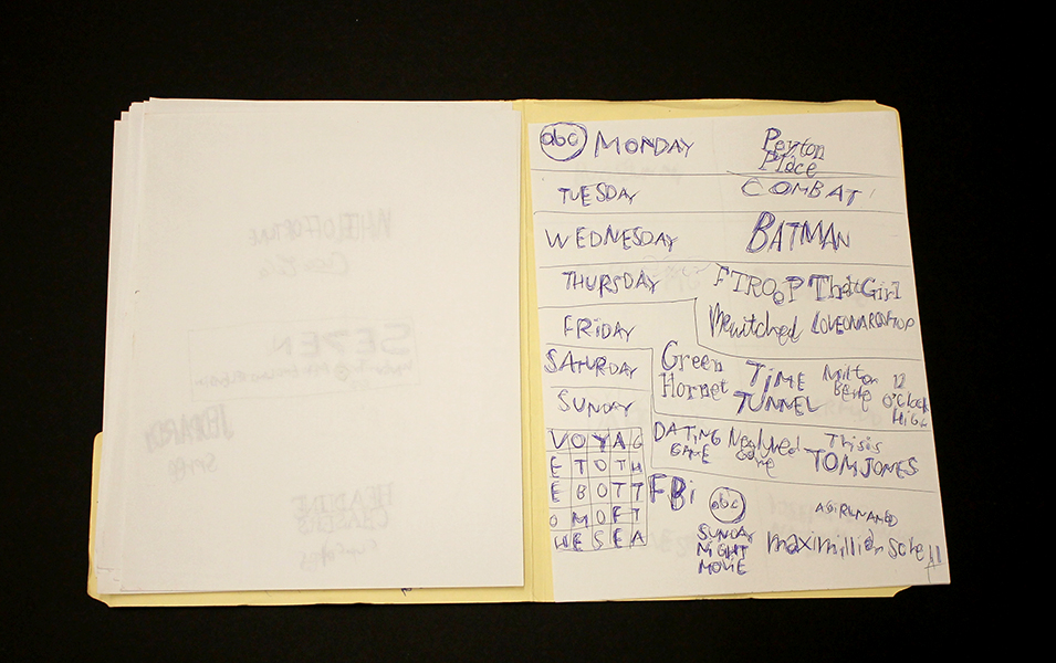
Much like Sokolow, Green engages in making work that begins with the rigorous practice of archiving information culled from his surroundings and interests, which then develops into intriguing, fictitious digressions. Dates and times, tv schedules, athletes, historical figures, and various pop culture references flow through networks of association - “KURT RUSSEL GRAHAM RUSSEL RUSSEL CROWE RUSSEL HITCHCOCK AIR SUPPLY ALL OUT OF LOVE…” Although the listing within his work sometimes gives the impression of being intuitive streams of consciousness, most of it proves to be very structured and complex within Green’s system. Rather than expression or even communication, the priority seems to be the collection of information or organization of ideas; the physical encoding of incorporeal information as marks on a surface is a method for making it tangible, possessable, and manageable.
Daniel Green, Pure Russia, 2011, Mixed media on wood, 9 x 23 x 3.5 inches
Pure Russia (detail)
From the perspective that Green invents, there’s an endless number of time sequences that haven’t been considered before. A grid of days and times (as in Pure Russia) imagines time passing in increments of one day and several minutes, then returns to the beginning of the series, stepping forward one hour, and proceeding again just as before. It could be cryptic if you choose to imagine these times having a relationship to one another, or it could instead be an original rhythm whose tempo spans days, so that it can only be understood conceptually as an ordered structure mapped through time - the significance of the pattern superseding that of specific moments.
By blurring the distinction between the articulation of ideas through text and the development of mark-making, Green’s highly original objects become unexpectedly minimal and material, yet simultaneously personal and expressive.
Daniel Green’s work will be included in Mapping Fictions, an upcoming group exhibition opening July 9th at The Good Luck Gallery in LA, curated by Disparate Minds writers Andreana Donahue and Tim Ortiz. Green has exhibited previously in Days of Our Lives at Creativity Explored (2015), Create, a traveling exhibition curated by Lawrence Rinder and Matthew Higgs that originated at University of California Berkeley Art Museum and Pacific Film Archive (2013), Exhibition #4 at The Museum of Everything in London (2011), This Will Never Work at Southern Exposure in San Francisco, and Faces at Jack Fischer Gallery in San Francisco.
Mapping Fictions: Roger Swike
Untitled, ballpoint pen on paper, 12 x 9 inches
Untitled, ballpoint pen and crayon on paper, 12 x 9 inches
Untitled, ballpoint pen and crayon on paper, circa 2013 12 x 9 inches
Roger Swike's ten crayons
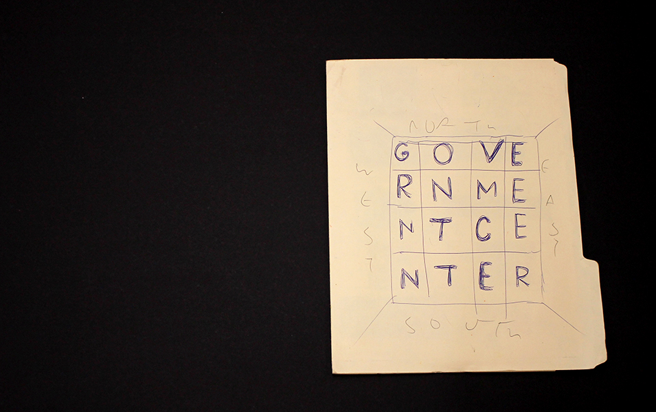
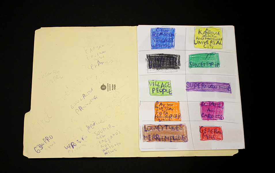
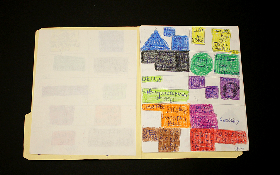
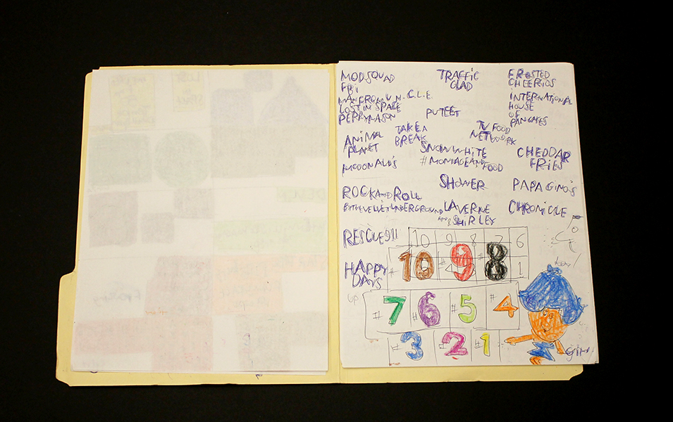
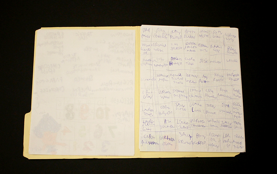
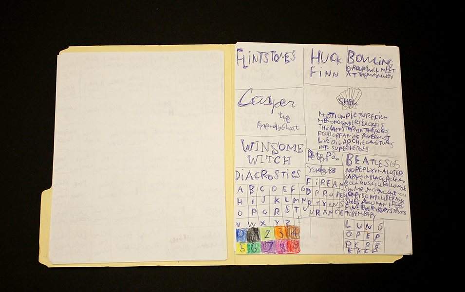
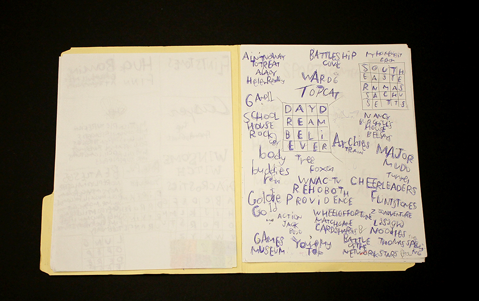
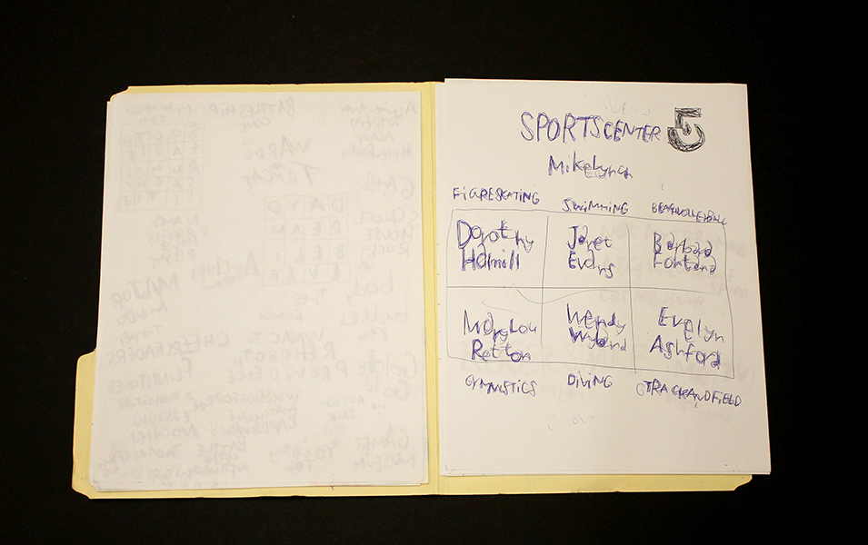
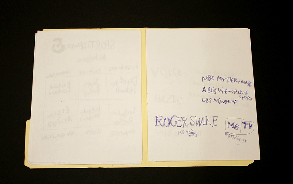
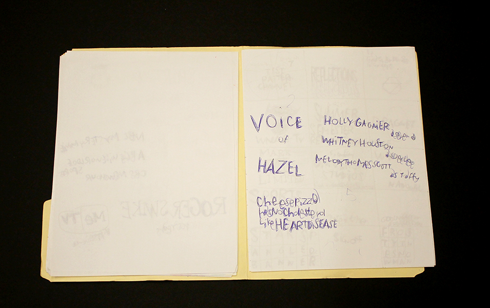
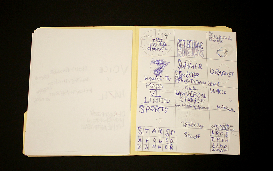
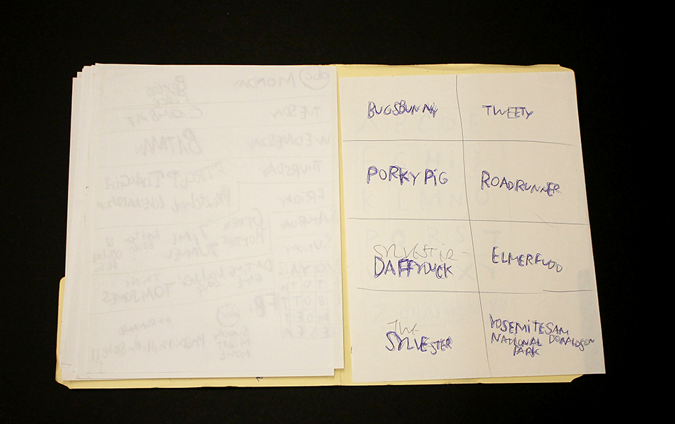
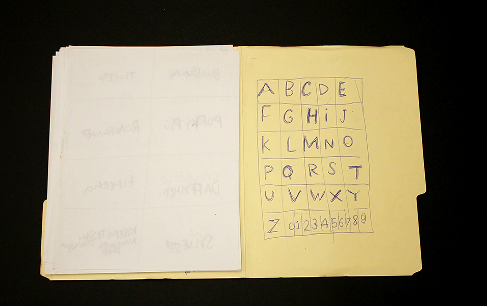
Roger Swike is an exceptionally prolific artist who works rapidly on many pieces simultaneously; much like Melvin Way, his drawing process channels an immediate and intuitive stream of information, yet is also executed with deliberation and great intention. Swike will often revisit drawings created at different times and deliberately organize them into various color-coded folders; the resulting works are an assertive, endearing proposition about what an art object can be. Within content that initially appears chaotic or arbitrary, familiar text referring to pop culture and the exterior world is pervasive. Black and blue ballpoint pens and ten crayons are utilized as though each tool has a symbolic role. Some ideas are organized neatly into grids, others are written in less regimented clusters or lists, primarily in multiple layers of ballpoint pen. Over time, curious relationships and subtle patterns emerge, such as references to the number 7 or numbers listed on their own counting down from ten (but when listed alongside the alphabet they ascend from 0 to 9).
Because Swike’s work is disciplined and systematic, the viewer is tempted to decipher the rigid system that defines it, but the true nature of the work seems to reside in the plasticity of its rules. A grid listing Loony Toons characters deviates from the pattern to include "YOSEMITE NATIONAL PARK SAM DONALDSON", numbers are written in black ballpoint pen without an overlapping of blue pen, words or phrases are redacted, yet the sequence and grid are still drawn using the ten selected colors…often it feels as though Swike isn't creating the system, but instead exploring it as a poet does language, both fluent and curious. Each time Swike's lexicon is revisited, it presents an opportunity to rethink its mysterious nature - possibly an archive, message, map, poem, or something else entirely.
Roger Swike’s work will be included in Mapping Fictions, a group exhibition curated by Disparate Minds writers Tim Ortiz and Andreana Donahue at the Good Luck Gallery in LA, July 9 - August 27. Swike (born in Boston, 1962) has shown previously at the Berenberg Gallery in Boston, Fuller Craft Museum, the Outsider Art Fair, Margaret Bodell Gallery, and Phoenix Gallery in New York. He has also been awarded a MENCAP award in London, England.
We first encountered Roger Swike’s work many years ago, as studio co-managers and facilitators in a progressive art studio in Nevada; we began visiting other studios while traveling (before the inception of Disparate Minds). Swike has maintained a studio practice at Gateway in Brookline, Massachusetts (the oldest progressive art studio in the US) since 1995. Despite this, his extensive body of work remains relatively unknown outside of the Boston area, possibly because the art world hasn’t quite been ready for work as contemporary and singular coming from a living, so-called outsider artist.
Mapping Fictions: Joe Zaldivar
West Club Entrance at NRG Stadium, graphite, micron, and marker on paper, 18" x 24", 2016
Street Map of City of Industry, California, graphite, micron, and marker on paper, 18" x 24",
Gates 5-8 of Sports Authority Field at Mile High, graphite, micron, and marker on paper, 18" x 24", 2016
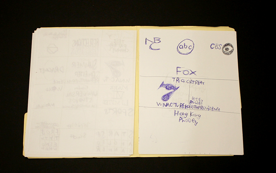
Joe Zaldivar’s work documents and reimagines disposable or forgotten media with permanence and idealism; his vast and varied oeuvre includes massive, detailed hand-drawn maps, intricate interiors and landscapes drawn from Google Street View imagery, and drawings referencing local business mailers, logos, advertisements, and tv stills. He has also compiled an enormous, ever-expanding archive of home-recorded video ephemera which is uploaded to a YouTube channel (including cold opens, sign-ons/sign-offs, and advertisement segments from obscure tv broadcasts dating back many years), all citing sources, dates, and times.
To parse the intent or underlying conceptual framework of Zaldivar’s intensely elaborate creative endeavor, his Street View landscapes and interiors provide an important entry point. As a whole, they feel like the collected documents of a digital explorer searching for and preserving scenes from around the world, often capturing iconic landmarks: sports stadiums, restaurants, famous storefronts, etc. Aesthetically, each of these drawings isolates a moment (a necessary quality of any still image), a tendency that’s especially engaged in his drawings, as in Cindy Sherman’s film stills. This sense of candid immediacy and stillness could be attributed to the automated eye of the google maps camera car; Joe's interpretations of these moments, however, are more nuanced and often altered.
The Coffee Roaster, 13567 Ventura Boulevard, Sherman Oaks, California, graphite, micron, and marker on paper, 18” x 24", 2016
The Coffee Roaster, for example, remains faithful to its source material except for a few deviations; the billboard has been replaced with one lifted from another image, and one of the patrons (whose face is blurred in the street view image), is replaced with a man loosely resembling Homer Simpson, both of which are references to a 1995 episode of the Simpsons (Treehouse of Horror VI). In this episode, Homer Simpson ends up at “Erotic Cakes”, a bakery in the real world via interdimensional travel, the actual filming location being the storefront of The Coffee Roasters. This drawing exemplifies the manner in which Zaldivar’s work traverses multiple layers of meaning - navigating the world, drawing connections between reality and fiction, and isolating or describing fully a specific moment.
Recorded during the USA Christmas movie special, a 1973 20th Century Fox Television remake of the movie "Miracle on 34th Street" starring Jane Alexander, David Hartman and Sebastian Cabot on Tuesday, December 19, 1989 on USA Network.
In this context, recording moments digitally and creating intuitive, thought-provoking connections across various media, Zaldivar’s YouTube channel is a compelling enigma. Zaldivar's channel isn’t the only one of its kind, this curious practice has a surprising cult following. He’s among the most popular, however, with almost 2000 subscribers and nearly 4 million total views of well over 1000 videos. Sometimes he records directly from recent broadcast television, while other segments are culled from VHS tapes found at yard sales. Whereas other channels featuring this kind of content are direct digital transfers from other media, Joe records his television screen by hand with a tablet computer - the filter of his gaze is always present. Much like his Street View drawings, these recordings are slightly unsteady, but intensely diligent. As extensive as his archive is though, the moments he chooses to document are just a few waypoints into the realm of ephemeral television media. There’s a distinct ambition across all of his works to address and highlight moments not originally intended to be the focus of the media that they reference (as evidenced particularly in this early work).
Zaldivar with a work in progress, from a recent studio visit at First Street Gallery Art Center
Chicago Area Vicinity Map, graphite, micron, and marker on paper, 90" x 48"
Given the map-like quality of Zaldivar’s process, it’s intuitive that his body of work would include actual maps. Zaldivar creates large-scale maps in 18” x 24” sections (usually divided into a grid of 8 or 10); he diligently works on one section at a time while referring to an iPad, with the completed sections stacked neatly beneath the one in progress. These hand-drawn cities reclaim selections from that endless modern world of digital maps, generated by swarms of satellites and computer systems, as a personal and human experience. Through this lens, his smaller drawings that incorporate both road maps and disposable ad imagery (logos, slogans, place names) can be understood as signifiers for a specific time and place.
Joe Zaldivar (b. 1990) attends First Street Gallery Art Center in Claremont, California (the same studio that supports the great Helen Rae). He has shown previously in Wunderkammer, an invitational group exhibition at Pitzer College's Nichols Gallery and Street Views, a solo exhibition at First Street Gallery Art Center. Zaldivar was the initial inspiration for the upcoming group exhibition Mapping Fictions: Daniel Green, William Scott, Roger Swike, and Joe Zaldivar at The Good Luck Gallery in LA, curated by Disparate Minds writers Tim Ortiz and Andreana Donahue, which will be on view July 9 - August 27, 2016.
Knicoma Frederick
Knicoma Frederick, Untitled (Candle Army Eyes) from the Series 80 Bit, 2006, Acrylic on canvas, 24” x 18”
Knicoma Frederick, Glory News Article from the Series Information 1600, 2012, marker and pen on paper, 8 ½” x 11”
Knicoma Frederick, Untitled (Elaborately Painted Pedicure) from the Series 80 Bit, 2008, colored pencil on paper, 8 ½” x 11”
Knicoma Frederick, from the series Die Evil 82, 2013
Knicoma Frederick, Unitled (Couple Painting/Interior) from the Series 80 Bit, 2010, Acrylic on canvas, 36 x 24 inches
“The painting is not on a surface, but on a plane which is imagined. It moves in a mind. It is not there physically at all. It is an illusion, a piece of magic, so what you see is not what you see … I think that the idea of the pleasure of the eye is not merely limited, it isn’t even possible. Everything means something. Anything in love or in art, any mark you make has meaning and the only question is ‘what kind of meaning?” - Philip Guston
Prolific visionary Knicoma “Intent” Frederick has lived the intensely dedicated life of an artist for whom painting is more than painting - it’s a way to access something deeper than merely tangible or social ends. Frederick’s work engages the practice of image design and creation with a mystical or prophetic intent, relying on and striving to access and utilize the magic inherent in the process of painting.
Sometimes remarkably akin to the work of William Scott, Frederick’s work possesses an abundance of idealism, realized as utopian visions of the future - proclamations from Glory News, superhero first responders defeating armies of demons, or a “love and justice” rocket ship flying overhead. Where Scott has a steadfast tone of praise and celebration, however, Frederick’s narrative works also include darker, stranger, sometimes ominous themes that afford them a sense of gravity, conflict, and romance.
Knicoma Frederick, Untitled (Couple Painting/Beach Scene) from the Series 80 Bit, 2010, Acrylic on canvas, 36" x 24"
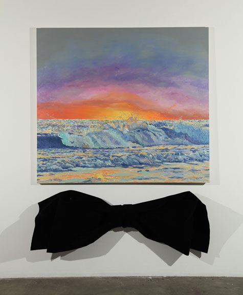
Works such as Untitled (Couple Painting/Beach Scene) live in a space characterized by a more cryptic sort of mysticism, in which painting becomes not only the method that Frederick employs, but also becomes incorporated into the content of the image - overtly, when paintings are included in the image, and less explicitly when “painting” as an archetype is present in the work via the presence of painting tropes (such as a dramatic seascape or elements of traditional still life). These tendencies also present themselves in the work of Los Angeles based painter John Seal.
In response to our inquiry about Frederick and the concept of paintings of paintings Seal remarked:
"The magic, really, is in the disconnect/misconnect. It is in the way the subject and its material delivery interface/intermesh with the viewer's life experiences--it is the surprise of finding anything in common, the surprise of seeing one's self, altered and new, reflected in the painting which in turn becomes new in the viewer's eyes. The magic is in this dual rebirth of viewer (subject) and painting (object). The magic is the painting's ability to make this dual rebirth visible. Painting paintings of paintings is, to me, a way to lead people into the mechanics of image, and to invite the viewer to examine their own relationship to looking: if a picture can be captured by a picture via the means (language) of painting, what can it do to the rest of the world?"
Knicoma Frederick harnesses these mechanics to not only compel the viewer to reflect on the capacity of painting, but to also assert the presence of his message in the world he envisions. The "dual rebirth" that painting facilitates is, for Frederick, a pathway into this realm that his work manifests, and painting is explicitly the magic by which this manifestation takes place.
In the course of discussing his WPIZ series of artist books, and a fictional video game called ArtFighter (which exists within WPIZ) Frederick articulates his manipulation of this mystical function of painting:
"People have heard of games like ‘Street Fighter’ and ‘Mortal Combat’ and ‘Tekken’ for PlayStation and XBox and all of those different types of game systems…But ‘Art Fighter…is fighting with artwork. You’re taking artwork and you’re fighting the situation with it. You’re taking a picture that represents what you want to have happen, done by the storyline in each book. You’re taking a picture, and you’re destroying the negative with it…I have an obligation to make the WPIZ so that the books are used for overcoming the evil that’s in the people’s way." (source)
Shortly before the establishment of the Creative Vision Factory (where Frederick maintains his studio practice), Director Michael Kalmbach encountered Frederick attempting to get permission at a drop-in mental health center to use the copy machine (unsuccessfully), presumably for the distribution of a handwritten series of newspapers (in the neighborhood of six hundred pages). Kalmbach cites this event as instrumental in the development of CVF (informing its goals, design, and function), not only due to the magnitude of this endeavor, demonstrating the need for and potential value of a studio of this kind, but also that the content of these newspapers provided important insight about both Frederick's personal experience and the mental health system in general.
Frederick’s works are conceptualized as series of books for which each work represents a specific page. Over the four years that he has been with CVF, he has published more than 25 artist books, each comprised of 125 - 150 works; prior to the publishing a book, the works can not be sold individually. Frederick has an extremely productive creative practice; Kalmbach estimates that he creates roughly 1000 works per year.
Knicoma Frederick is originally from Brooklyn, New York, but is currently based in Wilmington, Delaware. Recent exhibitions include All Different Colors and Outsiderism at Fleisher/Ollman in Philadelphia and previously at numerous venues in Wilmington, Delaware. He has work in the permanent collection of the Delaware Art Museum and is the recipient of an Emerging Individual Artist Fellowship from the Delaware Division of the Arts.
Courttney Cooper
Cincinnati Map, 2010, ballpoint pen on collaged paper, 64" x 88"
Untitled, 2015, ballpoint pen on collaged paper, 52" x 80"
Cincinnati Map, 2009, ballpoint pen on collaged paper, 51" x 85"
Cincinnati Map, 2009 (detail)
Cincinnati Map, 2009 (detail)
images courtesy Western Exhibitions and Visionaries + Voices
Cooper’s oeuvre is a ongoing narrative featuring Cincinnati, imparted with adoration and idealism. Drawings that are tenaciously committed to archiving the city’s developing reality in bic ballpoint pen, Cooper documents the destruction of old buildings and construction of new ones, while modifying details to reflect the time of year (often after they've been hung in an exhibition space). But they are also richly populated with celebratory, idealistic imagery - flags flying on rooftops, hot air balloons traversing the sky above the river, “Do not be afraid, be a precious friend! Zmile, you’re in Zinzinnati Ohio USA 2011”.
Cooper’s works are often characterized as maps, which isn’t an entirely accurate categorization. Visionaries + Voices’ Krista Gregory points out:
I've come to learn that Courttney has been drawing "aerial views" of Cincinnati since he was a small child, first using an etch-a-sketch. His mark-making certainly reflects having this type of information/tool...I see the work that Courttney creates more in the vein of landscape, or townscape; as they are romantic in their visceral love for this place...I think that this work being categorized as ‘maps’ is misleading and couches them in something that is more related to Courttney's disability rather than to what it is that he is actually expressing and creating. They are not accurate. They are not drawn completely from memory. I've witnessed people hold on to wanting to think these things because it makes the work accessible or novel in some way. I sort of think that it is a reductive way to see them
The desire to see Cooper’s works as maps may be the consequence of trying to categorize autistic thinking - relegating autistic artists as spectacles of savant-ism. Courttney Cooper, however, is not comparable to Stephen Wiltshire, for example; his drawings are not an accurate configuration of streets as a road map indicates, nor are they a repetitious anonymous depiction of a city in an illustrative way. They're indeed informed by an intimate experience with his city - an astounding wealth of information accumulating across increasingly massive surfaces (created by gluing together scrap paper that Cooper gathers while working at Kroger). But this isn't the subject of the work, it's only the formal foundation that serves as a vehicle for Cooper’s voice. Cooper’s drawings are a complex and authentic network of specific places and structures; his streets are composed of details from memory or observation, cataloging expressions of particular perceptions in particular moments. The relationship of these moments to each other in space is approximated, as in memory - all of which culminates in a dizzying realm of overlapping information that becomes a living record, adorned generously with nostalgic, commemorative expressions of community and identity.
Zinzinnati Ohio USA: The Maps of Courttney Cooper curated by Matt Arient, is a selection of Cooper's drawings from 2005 - 2015, currently on view at Intuit through May 29th. Cooper is represented by Western Exhibitions in Chicago, where he has an upcoming solo exhibition November 12 - December 31, 2016. Cooper has maintained a studio practice at Visionaries + Voices in Cincinnati since 2004; he has exhibited extensively in the greater Cincinnati area and has work in the Cincinnati Art Museum collection. Selected exhibitions include the Wynn Newhouse Exhibition at Palitz Gallery, Syracuse University (as a 2015 Wynn Newhouse Award recipient), Cincinnati Everyday at the Cincinnati Art Museum, Maps + Legends: The Art of Robert Bolubasz and Courttney Cooper at Visonaries + Voices, Studio Visions at the Kentucky Museum of Art, Cincinnati USA: Before Meets After at PAC Gallery, and Indirect Observation at Western Exhibitions.
