Marlon Mullen’s second solo exhibition at JTT Gallery is an expansive collection of recent works by this San Francisco-based hero in the progressive art studio movement.
Read MoreEvelyn Reyes: Ritual, Rules, and Abstraction
San Francisco-based artist Evelyn Reyes has been diligently creating robust series of minimalist drawings at Creativity Explored for the past 15 years; over this time she has consistently maintained a presence in the contemporary outsider art discourse...
Read MoreA Conversation with Sophia Cosmadopoulos
Cosmadopoulos is currently a coordinator and facilitator at LAND Studio and Gallery, a progressive art studio provided by the League Education & Treatment Center in DUMBO, Brooklyn. Her valuable perspective is also informed by an uncommonly dynamic career in this field...
Read MoreAlan Constable
Alan Constable has been creating and exhibiting work in various media for the past thirty years, including painting and drawing, but it is the extensive body of ceramic works he has formed over the past decade that has increasingly garnered attention and acclaim...
Read MoreSusan Te Kahurangi King: Drawings 1975 - 1989
Susan Te Kahurangi King’s current exhibition marks her second, highly anticipated solo show at Andrew Edlin, following the critically acclaimed debut of the New Zealand-based artist with the space in 2014, Drawings from Many Worlds. Known for her vibrant and frenetic biomorphic abstractions, Drawings 1975 - 1989 curated by Chris Byrne and Robert Heald features a lesser known series from her prolific and consistently impressive practice...
Read MoreThe Eloquent Place: Harald Stoffers and Josef Hofer at Cavin-Morris Gallery
Harald Stoffers, Brief 163, 2010, Waterproof felt tip pen on cardboard, 39.375 x 27.5 inches
The Eloquent Place is a powerful exhibition featuring intimate works on paper by Harald Stoffers and Josef Hofer, currently on view at Cavin-Morris in NYC. In a compelling pairing of these artists Cavin-Morris proposes:
Both artists seek to establish a sense of internal and external Place by creating worlds that unfold within and around their own bodies. The act of drawing is a method of controlling survival; in Hofer's case figuratively, and in Stoffers’ case by emotionally charging the written words with visual intensity. For both the art becomes a conduit toward a way of balance and self-placement in the world.
The dialogue between the two bodies of work results in a rich commingling of concepts and earnest explorations of representation versus abstraction through drawing. The opposition of systematic processes with highly personal subject matter reveals a strong connection between the work of Stoffers and Hofer, while exposing a candid vulnerability.
Josef Hofer’s partially clothed and fully nude figures originated as self-portraits drawn from memory of his reflection in a small mirror (with a substantial, ornate wooden frame) placed on his bedroom floor. The priority of his images resides in the recollection and expression of sections of the body, connections of limbs and folding flesh - not reflecting a moment in time or visual representation of the figure, but rather a narrative of observation. He captures a series of moments spent noticing the body, which is then recalled as drawing. Abstract of the obfuscating influence of rendering, likeness, or proportions, Hofer’s marks are naked as they describe the truncated contours of the body he recalls.
An important element included in every portrait, is the frame around the perimeter of the drawing surface (always alternating in bands of orange and yellow colored pencil, outlined in robust graphite). Speculations surround the origin or purpose of this frame; it's generally understood as a depiction of the frame of Hofer’s mirror, although it’s included in every piece, not just the drawings featuring figures. Hofer doesn’t discuss or explain his work since he’s primarily non-verbal - ultimately the genesis and nature of this device remains unclear.
It is certain that, much like its presence in Martin Ramirez’s drawings, the frame is an integral element and not merely a decorative one; Hofer has included it consistently since 2003, though in various iterations. Created slowly and deliberately (as evidenced by the labored impressions of his blunt implement), the frame often becomes quite elaborate and is even more time intensive to develop than the current variation of figure within. Elisabeth Telsnig, who worked with Hofer (at the creative program he attends) in Ried, Austria from 1997 until recently, states, “He draws a figure again and again, looking for ‘the perfect figure’, ‘the perfect position’. Only, when he has the impression, he has found it, can he stop the series. He seems to like to to be under constraint.”
The drawing of the frames is formally opposite to that of the figures (using a straight edge) and bound by consistent rules across all of his works - always orthogonal (even when they evolve to deviate from the rectangle of the perimeter) and meeting at a diagonal, as a frame does.
It's important to notice the use of a straight edge by an artist whose figures are drawn in such a personal way, in which his hand is exposed. The use of a mechanical tool or process to contrast with (or justify) this exposed hand is almost universal throughout art history. From the explicit use of geometric and mathematical rules to restrict the influence of the artist’s voice in catholic iconography, to JMW Turner’s bits of architecture providing an armature for an ethereal expression of light and air, to Gerhard Richter’s squeegee obscuring his hand-painted marks. Chuck close’s grids, Gabriel Orozco’s checkered patterns, the frame itself, or the smooth white walls of a gallery space all strive to achieve the same end as a pencil guided along a straight edge - respite from the expressive responsibility of mark-making, submission to something sure, inert, and objective. In Hofer’s work these methodical choices build inward towards his figures, sometimes working their way around, completely enveloping them. The interactions of these opposing processes is a highly original visual and procedural poetry.
Josef Hofer, Untitled, 2007, pencil and colored pencil on paper, 17.32 x 23.62 inches
Josef Hofer, Untitled, 2014, Pencil and colored pencil on paper, 19.69 x 27.56 inches
Josef Hofer, Untitled, 2005, Graphite and colored pencil on paper, 17.32 x 23.62 inches
Josef Hofer, Untitled, 2005, (detail)
Harald Stoffers’ cascading rows of horizontal lines and text are hand-written letters, most often addressed to his mother. Deeply diligent and well-meaning, his notations describe in great detail ordinary daily events such as his choice of clothing, travel schedules, or activities, yet also embody a more romantic personal narrative and the endeavor of carefully poring over increasingly monumental letters that are rarely sent. This daily ritual of letter-writing has dominated his practice for over twenty years. They have increased in scale since Stoffers began working in the Hamburg studio at Galerie der Villa in 2001; previous to that he would freely give away very small notes to anyone around him.
Stoffers generously establishes a preliminary, wavering framework that mimics ruled paper, which is then loosely used as a guide for the placement of text. In a palette even more restricted than Hofer's, his erratic script primarily appears in black ink, with an occasional rogue excerpt in blue. Inconsistent in spacing behavior, the text expands, contracts, and sometimes much taller letters span several lines. Stoffers very often draws over every line repetitively, with some words receiving more emphasis than others; original text is often obscured by the subsequent layers of mark-making, ultimately rendering it illegible.
In Stoffers’ work, a similar contrast between the systematic and personal are engaged with in a different manner than Hofer’s corporeal vernacular. In his works, which resemble sheet music or unraveling textiles from a distance, the striations and the text itself provide his objective process, where his unsteady hand and his vision through language provide the contrasting expression. Where Hofer uses a system of structured marks to assert a rigid context for his figures, Stoffers appeals to a familiar methodology to assert himself dutifully, not inventing a system, but engaging in common, learned systems - penmanship, list making, and the organization of language.
The conversation between Stoffers and Hofer in The Eloquent Place compliments the dialogue between vision and process within each artist’s work. The association that relentless drawing, manipulating, or obscuring of text has to the content and intention of that text can be understood in terms of the relationship of Hofer’s systematic straight lines to his divulging recollections of the figure, and vice versa. The intellectual depth of these parallels isn’t in the specifics of their implications, but in the quiet emotional power of their coexistence in this installation. These bodies of work are typified by genuine intention, vulnerability, and a complete faith in the meaningful act of drawing to validate their messages through diligent labor as draftsmen.
Harald Stoffers and Josef Hofer will be on view at Cavin-Morris through October 8th.
Harald Stoffers, Brief 295, 2014, Ink on paper, 11.5 x 8 inches
Harald Stoffers, Brief 336, 2014, Waterproof felt tip pen on paper, 16.5 x 11.75 inches
Harald Stoffers, Brief 192, August 12th, 2011, Ink on paper, 19.75 x 19.75 inches
Harald Stoffers, Brief 192, August 12th, 2011 (detail), all images courtesy Cavin-Morris Gallery
Gateway Arts
Gateway Arts, in Brookline, Massachusetts (just outside of Boston) is one of the largest and, arguably, the oldest progressive art studio in the country, originally founded in 1973 (just prior to the 1974 creation of Creative Growth by Katz in Oakland). Whereas the Katz west coast programs closely resembled the model we consider most progressive for a fine arts program from their inception, Gateway grew into this model over time and continues to do so. Today Gateway is an exicting and important program, home studio to many great arstis including Roger Swike (who was included in “Mapping Fictions” at The Good Luck Gallery), Joe Howe (recently noticed by Matthew Higgs for a potential solo show at White Columns) Yasmine Arshad, Michael Oliveira and many, many, others. The studio currently provides workspace and facilitation to over 100 artists.
Gateway was initially founded in direct response to a deinstitutionalization initiative (then named “Gateway Crafts”) as a weaving and ceramics studio for 10 individuals. Over the past 43 years, the program has grown, evolved, and maintained an effort to stay in touch with progressive ideas. A detailed history of Gateway and their relationship to the emerging progressive art studio movement is detailed in the essay “Outsider Art: the Studio Art Movement and Gateway Arts” by Rae Edelson, who has been the program’s director since 1978.
Yasmin Arshad, Untitled, marker on paper, image courtesy Gateway Arts
Gateway’s rich history is evidenced in their exceptionally dynamic approach to every aspect of what they do - the populations they support, the kind of art created, and methods they implement to promote and sell artists’ work. Even as they participate in fine art exhibitions at high level galleries, craft continues to be an important part of their program in a way that may be somewhat subversive to traditional ideas of fine art. More effectively than any other progressive art studio in the country, Gateway sells handmade craft objects in their own retail store, while also supporting the professional fine art careers of several of their artists.
The studio (a space they have been using since 1980) is separated into several sections, each of which is lead by a staff facilitator; artists rotate among the various work spaces from day to day on a regular schedule. This approach is conducive to (or strongly encourages) artists to work in a wide range of media. This isn’t uncommon, many studios have workspaces for various uses, usually based on media (ceramics, printmaking, sculpture, etc.). Gateway has an exceptionally large number of spaces, providing a wider range of ideas, which have come into being over a long period of time and aren’t necessarily defined by media in the typical sense.
Gateway’s main studio includes workspaces for “Pottery”, “Folk art”, “Fabric”, “Paper, “Weaving”, and “Art Making”; in addition to the main studio, “Studio A” provides various creative supports and resources for those with psychiatric disabilities. Each area has a supervisor/facilitator who specializes in its respective media and each artist has a weekly schedule that determines which area they work in daily. A potential problem with this complex structure is that it could distract from an artist’s ability to develop a consistent, independent method of working within any one medium. An artist like Roger Swike, however, demonstrates that Gateway leaves room for artists with a well developed vision to operate independently from this structure when they’re prepared to do so. While Roger may sometimes dabble in other media if he chooses to, he’s free to engage with his own practice of working on paper, that he has developed over the course of his long career with Gateway.
Learning to understand the unlimited potential value of a work of art is an important aspect of being an artist, and an important concept for progressive art studios to endeavor to communicate to their artists. Intuitively, one might imagine that the creation of lower value craft objects in the same space as fine art may undermine the studio’s ability to communicate that concept (and uphold that principle). For many programs, the fine art standard is considered to be directly in conflict with craft for this exact reason. Craft in Gateway’s studio, however, is rooted in a tradition of understanding craft as art on a higher level. Artistic director, Steven De Fronzo explains that during Gateway’s formative years in the 80s, the creative community in the Boston area embraced craft as an alternative to an art world that felt inaccessible, or elitist. In this way, craft was akin to the outsiderism of the time.
The fine art vs craft conundrum has a complicated history in progressive art studios; at its most problematic, craft programs are designed and operated on the assumption that individuals with disabilities aren’t capable of making fine art. In these cases, the studios can become assembly workshops that produce crafty “handmade” objects. In their best form, however, providing resources in a progressive art studio to engage in craft diversifies the opportunities available to artists in a way that is essential. Programs that don’t have an admissions process based on a portfolio review inevitably have many artists who will find craft processes and creativity with functional ends as a more intuitive or appropriate path.
In practice, what's most essential is how the artist chooses one path over the other, and how the standard is maintained - creative projects of any kind are created with as much independence and creative freedom as possible. As the the art world progresses, new facilitators bring new ideas to Gateway - as the use of craft processes becomes more prevalent in contemporary art, the use of craft processes become available in their studio on those terms. Staff facilitators present concepts about art-making in terms of their own expertise; ultimately at any progressive art studio, the onus is on artists to staff as examples, not authorities, with artists making choices about their approach to art independently. The critical element is that this relationship is understood by the staff, and independence or divergence from the structure is encouraged when it begins to emerge.
Mapping Fictions at The Good Luck Gallery
We recently had the honor of guest curating an exhibition at The Good Luck Gallery, an important, new space in Los Angeles. Founded and directed by former Artillery publisher Paige Wery, The Good Luck Gallery is the only space in LA dedicated to showing the work of self-taught artists. Wery fosters the burgeoning careers of artists such as Helen Rae and Deveron Richard, who maintain studio practices in progressive art studios, as well as artists like Willard Hill, who fall into the Outsider, Visionary, or Vernacular categories. Mapping Fictions, curated by Andreana Donahue and Tim Ortiz, opened on July 9th and will be on view through August 27th.
Read MoreMapping Fictions: William Scott
Inner Limits to the Future of Hollywood of the Real Science Fiction Movies, acrylic on canvas, 48" x 54", 2013
The Twilight Zone, acrylic on canvas, 36" x 48", 2014
Inner Limits Will Exist in 2017 of a Real People of New Science Fiction, acrylic on paper, 25" x 33"
San Francisco-based artist William Scott is a believer in a better society, a self-described “peacemaker” and “architect”. His works are the celebratory announcement of the wholesome future; they not only imagine an alternate universe reflecting his personal aspirations, but proclaim with joyous conviction his utopian vision of San Francisco, “Praise Frisco”. Scott’s paintings, drawings, and sculptures are executed in an aesthetic consistent with this gospel of idealism and excellence, shining with a pristine vibrance.
William Scott’s paintings of cityscapes and beaming figures surrounded by bold text are well known and widely collected; Mapping Fictions will also include lesser known works that delve into specific plans for Praise Frisco that demonstrate surprising depth and scope, beyond just a notion of that place. In these works, Scott strives to pull the world he sees into reality by imagining its common details. Optimistic plans for ordinary architecture, floor plans of “Disneywood” condos, and development company logos all express directly that this could actually exist with an earnestness reflected in a letter to the Mayor Gavin Newsom, calling for or announcing the news of Praise Frisco.
Scott’s work can be understood in the context of the intent and ideals of Theaster Gates or Bertrand Goldberg, who have employed the traditional agency of art-making to guide communities in inventing better versions of themselves.
Like Goldberg, Scott’s architectural drawings and models recall the spare, utilitarian designs for community housing as envisioned by the Bauhaus, an idealistic solution for social progression. Goldberg “was more than an architect - he was also a philosopher. In his utopian worldview, architecture had the power to create democratic communities by serving people from all levels of society while remaining sensitive to the needs of individuals. Architects were not just capable of bringing about a better future for everyone, they were morally obligated to do so.” (source)
Disneywood in Hunters Point Areas in San Francisco for the Redevelopment Agency, marker and ink on paper, 8.5" x 11" 2006
Hunters Point Hills in 2040s for New Developments, marker and ink on paper, 18" x 24", 2007
Theaster Gates’ creative practice extends beyond his studio as social activism, urban planning, and the ethical redevelopment of distressed properties, which manifests as an immediate, tangible influence that Scott’s work does not. There proves to be commonality, however, in the ambition to activate change and critically engage the public through art. Both Scott and Gates are driven to preserve and resurrect values from the past and a sense of community that has been lost. Gates explains:
The reimagining is a means to an end, and sometimes it is its own end. There are wasted opportunities that are waiting to be beautiful again, and I'm giving them a charge. It's not so much that the buildings on Chicago's South and West sides are vacant, but that they started to lose value for the black community. These buildings had so much soul, but we imagined that, because of the violence and the schools, we should be somewhere else. So these buildings lost their soulfulness. I'm interested in showing there is still so much latent power in these buildings, and by simply making these spaces available again, and open again, great things can happen. (source)
Whether an intentional fiction, genuine aspiration, or prophecy, Scott’s elaborate narrative is a creative vehicle for social commentary, as well as a context for an impassioned and highly personal expression of his commitment to recurring concepts of humanity, spirituality, identity, and community.
William Scott’s work is included in the upcoming exhibition Mapping Fictions, curated by Disparate Minds founders Tim Ortiz and Andreana Donahue, July 9 - August 27 at The Good Luck Gallery in LA. Scott (b. 1964) maintains a studio practice at Creative Growth in Oakland, California. Scott is widely collected and has work in the permanent collections of the MOMA and The Studio Museum in Harlem. He has exhibited previously in solo exhibitions at White Columns and group exhibitions at Park Life Gallery (San Francisco), Gavin Brown’s Enterprise and the Outsider Art Fair (NYC), Hayward Gallery (London), Yerba Buena Center for the Arts (San Francisco), the Armory Show (NYC), Palais de Tokyo (Paris), and NADA (Art Basel, Miami).
Change to Mayor Edwin Lee, Ink on paper, 8.5" x 11", 2003
Mapping Fictions: Daniel Green
Daniel Green, Fifteen People, 2009, Mixed media on wood, 14.25 x 22.5 x 1.75 inches
Daniel Green, Little Mac vs Soda Poponski, 2015, mixed media on wood, 11.5 x 15 inches
Daniel Green, The Sun, 2015, mixed media on wood, 6 x 16.5 x 1 inch
Daniel Green, Business Delivery, 2011, Mixed media on wood, 13 x 29 x 1 inches
Daniel Green's process is slow and intimate; quietly hunched over his works in the bustling studio, he draws and writes at a measured pace. These detailed works are an uninhibited visual index of Green’s hand; when read carefully, they become jarring and curious, slowly leading the viewer to meaning amid the initial incoherence. Green’s text is poetic and complex - language and thought translated densely from memory in ink, sharpie, and colored pencil on robust panels of wood. Figures and their embellishments are drawn without a hierarchy in terms of space occupied on the surface; they are at times elaborate and at other times profoundly simple. The iconic figures’ facial expressions (Jesus, Abraham Lincoln, Tina Turner, video game characters, etc.) are generally flat with proportions stretching and distorting subject to Green’s intention.
Ultimately, these drawings compel the viewer to internalize and decipher Green’s ongoing, non-linear narrative. His drawings call to mind Deb Sokolow’s humorous, text-driven work, but are less diagrammatic and concerned with the viewer. In an interview with Bad at Sports’ Richard Holland, Sokolow elaborates on her process:
I’ve been reading Thomas Pynchon and Joseph Heller lately and thinking about how in their narratives, certain characters and organizations and locations are continuously mentioned in at least the full first half of the book (in Pynchon’s case, it’s hundreds of pages) without there being a full understanding or context given to these elements until much later in the story. And by that later point, everything seems to fall into place and with a feeling of epic-ness. It’s like that television drama everyone you know has watched, and they tell you snippets about it but you don’t really understand what it is they’re talking about, but by the time you finally watch it, everything about it feels familiar but also epic. (Bad At Sports)
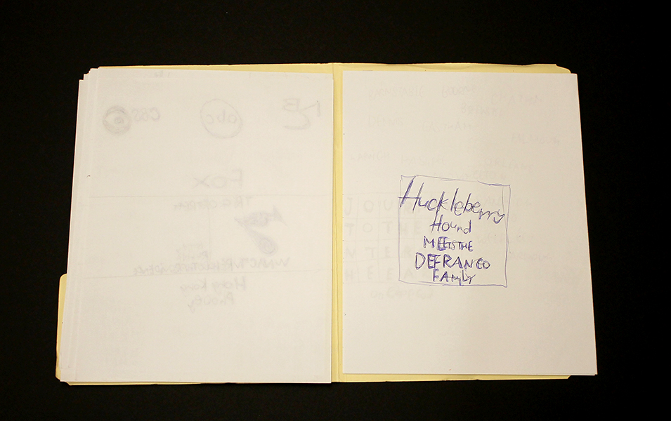
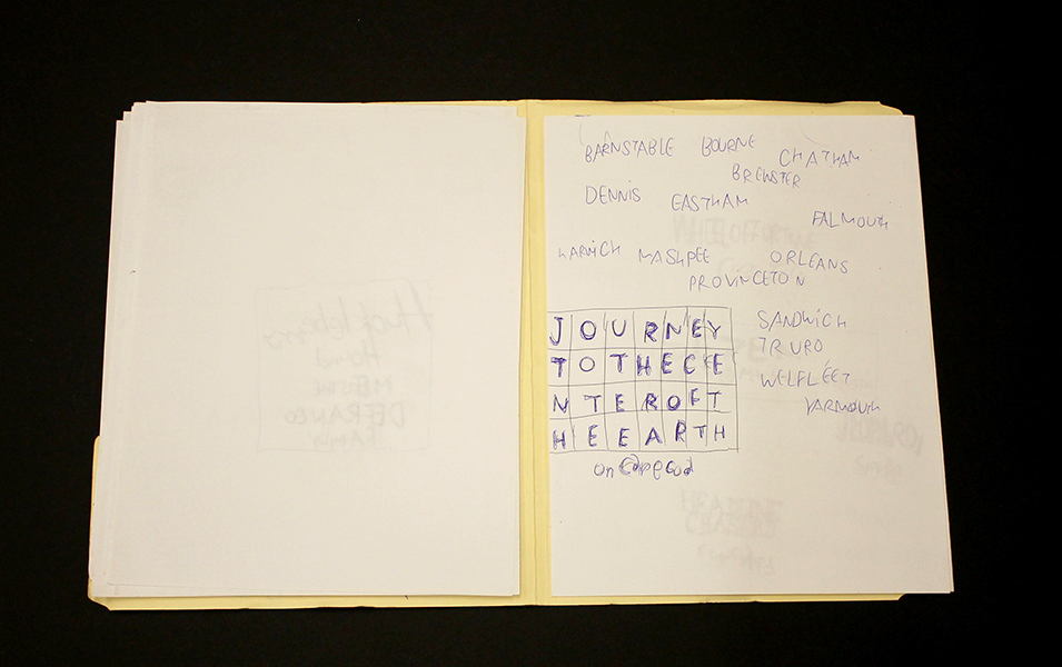
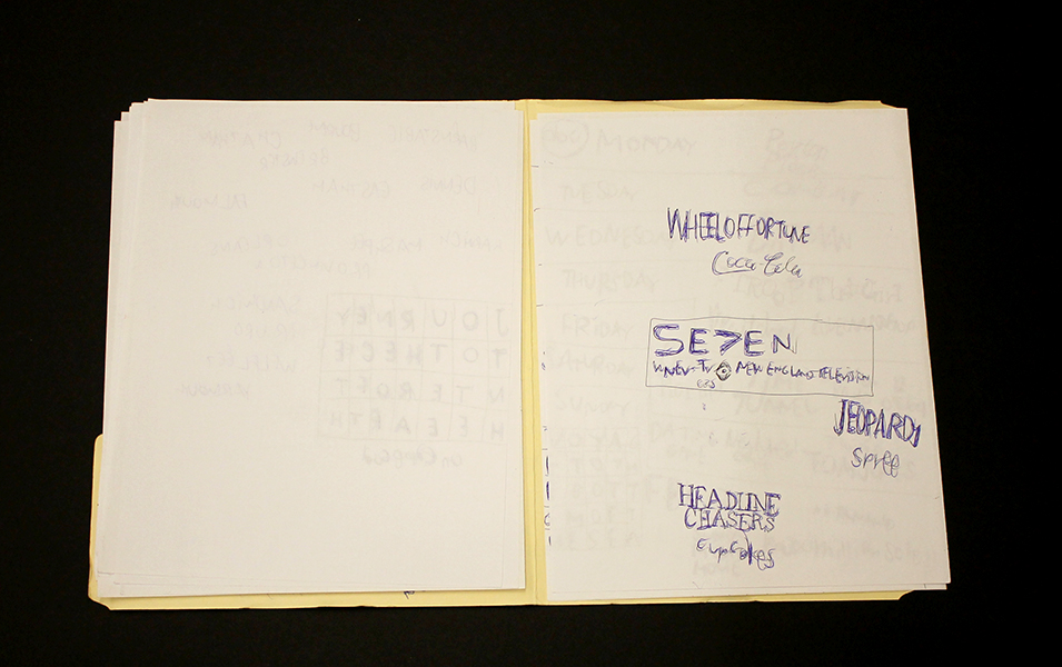
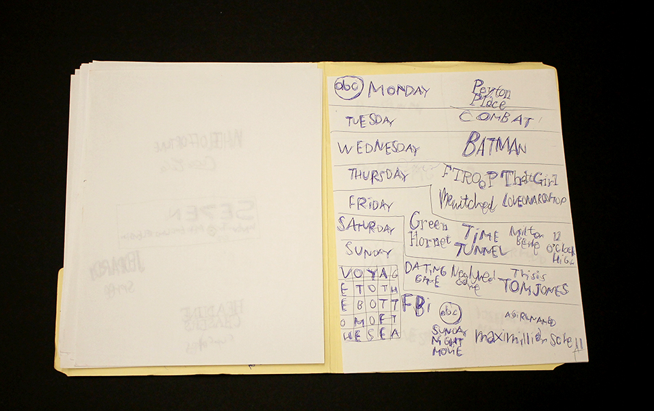
Much like Sokolow, Green engages in making work that begins with the rigorous practice of archiving information culled from his surroundings and interests, which then develops into intriguing, fictitious digressions. Dates and times, tv schedules, athletes, historical figures, and various pop culture references flow through networks of association - “KURT RUSSEL GRAHAM RUSSEL RUSSEL CROWE RUSSEL HITCHCOCK AIR SUPPLY ALL OUT OF LOVE…” Although the listing within his work sometimes gives the impression of being intuitive streams of consciousness, most of it proves to be very structured and complex within Green’s system. Rather than expression or even communication, the priority seems to be the collection of information or organization of ideas; the physical encoding of incorporeal information as marks on a surface is a method for making it tangible, possessable, and manageable.
Daniel Green, Pure Russia, 2011, Mixed media on wood, 9 x 23 x 3.5 inches
Pure Russia (detail)
From the perspective that Green invents, there’s an endless number of time sequences that haven’t been considered before. A grid of days and times (as in Pure Russia) imagines time passing in increments of one day and several minutes, then returns to the beginning of the series, stepping forward one hour, and proceeding again just as before. It could be cryptic if you choose to imagine these times having a relationship to one another, or it could instead be an original rhythm whose tempo spans days, so that it can only be understood conceptually as an ordered structure mapped through time - the significance of the pattern superseding that of specific moments.
By blurring the distinction between the articulation of ideas through text and the development of mark-making, Green’s highly original objects become unexpectedly minimal and material, yet simultaneously personal and expressive.
Daniel Green’s work will be included in Mapping Fictions, an upcoming group exhibition opening July 9th at The Good Luck Gallery in LA, curated by Disparate Minds writers Andreana Donahue and Tim Ortiz. Green has exhibited previously in Days of Our Lives at Creativity Explored (2015), Create, a traveling exhibition curated by Lawrence Rinder and Matthew Higgs that originated at University of California Berkeley Art Museum and Pacific Film Archive (2013), Exhibition #4 at The Museum of Everything in London (2011), This Will Never Work at Southern Exposure in San Francisco, and Faces at Jack Fischer Gallery in San Francisco.
Mapping Fictions: Roger Swike
Untitled, ballpoint pen on paper, 12 x 9 inches
Untitled, ballpoint pen and crayon on paper, 12 x 9 inches
Untitled, ballpoint pen and crayon on paper, circa 2013 12 x 9 inches
Roger Swike's ten crayons
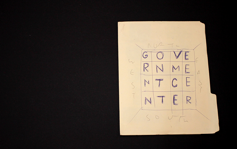
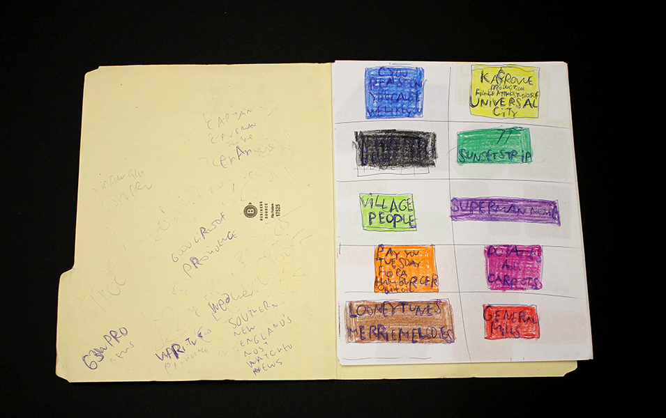
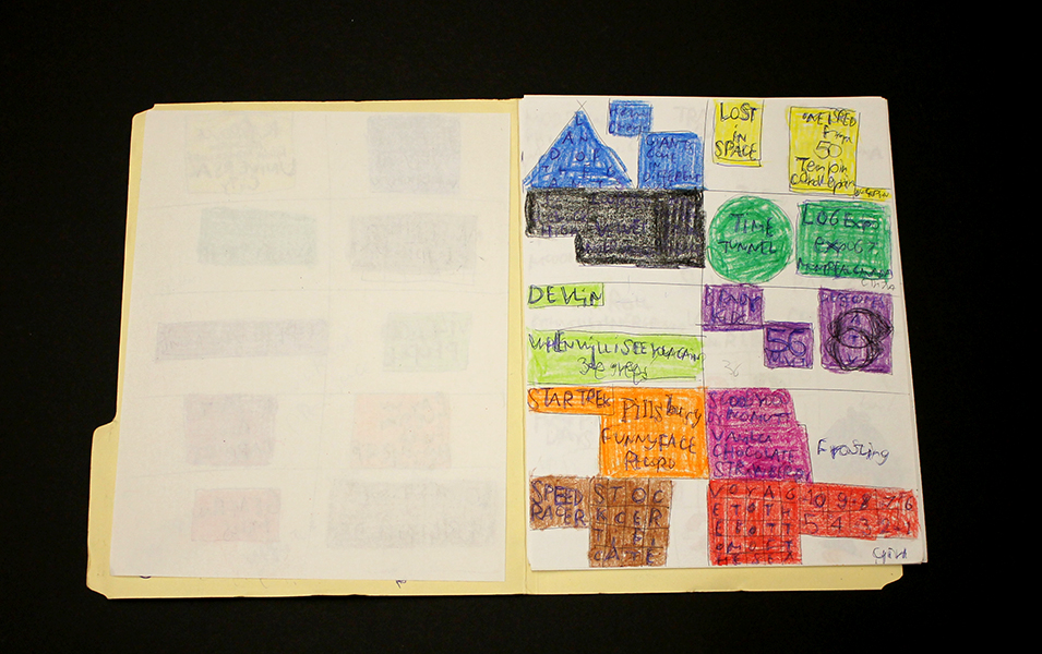
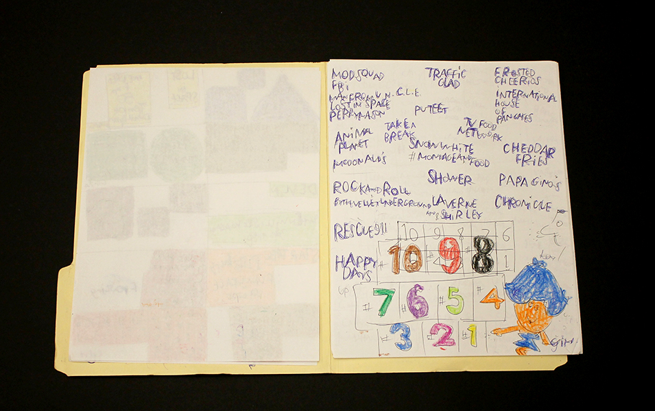
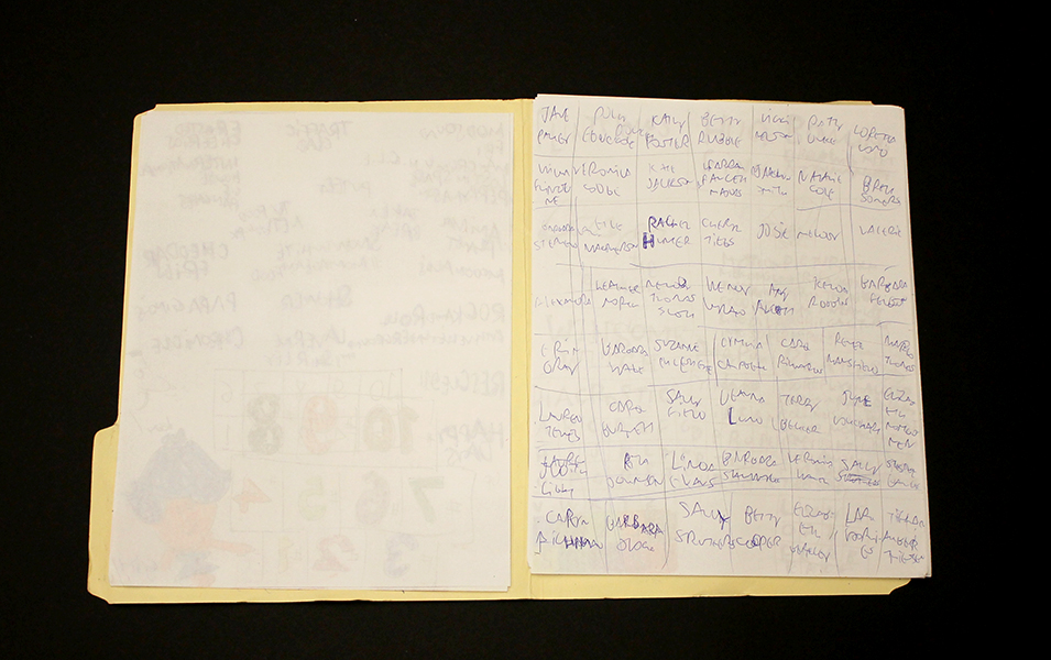
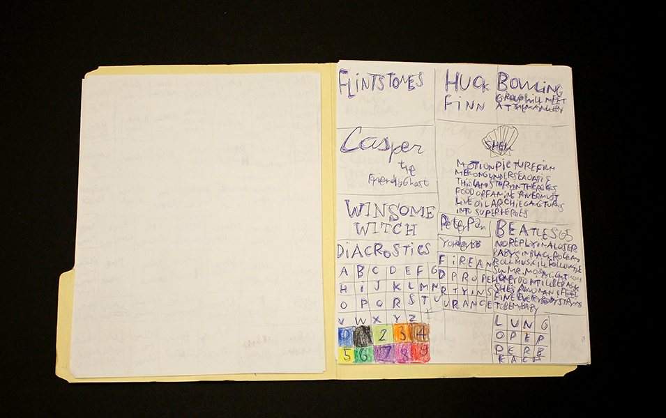
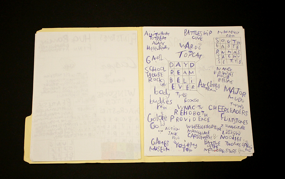
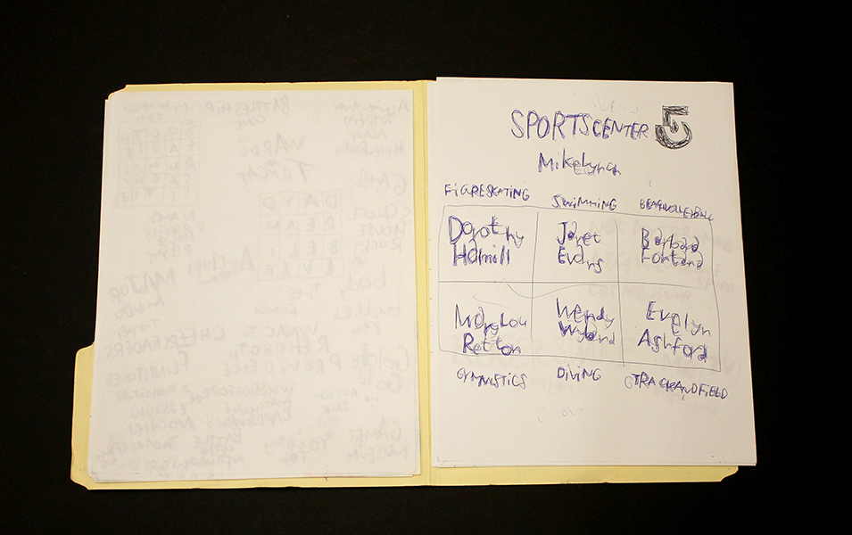
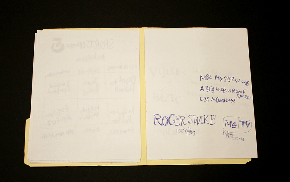
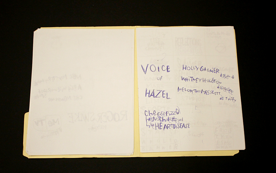
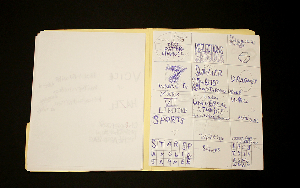
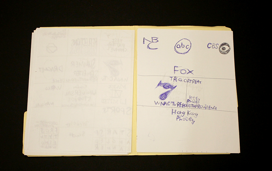
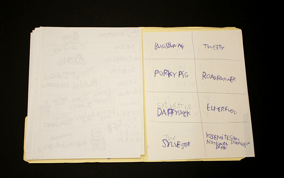
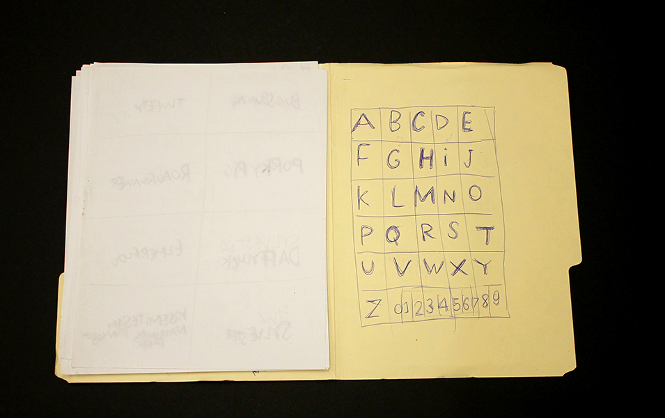
Roger Swike is an exceptionally prolific artist who works rapidly on many pieces simultaneously; much like Melvin Way, his drawing process channels an immediate and intuitive stream of information, yet is also executed with deliberation and great intention. Swike will often revisit drawings created at different times and deliberately organize them into various color-coded folders; the resulting works are an assertive, endearing proposition about what an art object can be. Within content that initially appears chaotic or arbitrary, familiar text referring to pop culture and the exterior world is pervasive. Black and blue ballpoint pens and ten crayons are utilized as though each tool has a symbolic role. Some ideas are organized neatly into grids, others are written in less regimented clusters or lists, primarily in multiple layers of ballpoint pen. Over time, curious relationships and subtle patterns emerge, such as references to the number 7 or numbers listed on their own counting down from ten (but when listed alongside the alphabet they ascend from 0 to 9).
Because Swike’s work is disciplined and systematic, the viewer is tempted to decipher the rigid system that defines it, but the true nature of the work seems to reside in the plasticity of its rules. A grid listing Loony Toons characters deviates from the pattern to include "YOSEMITE NATIONAL PARK SAM DONALDSON", numbers are written in black ballpoint pen without an overlapping of blue pen, words or phrases are redacted, yet the sequence and grid are still drawn using the ten selected colors…often it feels as though Swike isn't creating the system, but instead exploring it as a poet does language, both fluent and curious. Each time Swike's lexicon is revisited, it presents an opportunity to rethink its mysterious nature - possibly an archive, message, map, poem, or something else entirely.
Roger Swike’s work will be included in Mapping Fictions, a group exhibition curated by Disparate Minds writers Tim Ortiz and Andreana Donahue at the Good Luck Gallery in LA, July 9 - August 27. Swike (born in Boston, 1962) has shown previously at the Berenberg Gallery in Boston, Fuller Craft Museum, the Outsider Art Fair, Margaret Bodell Gallery, and Phoenix Gallery in New York. He has also been awarded a MENCAP award in London, England.
We first encountered Roger Swike’s work many years ago, as studio co-managers and facilitators in a progressive art studio in Nevada; we began visiting other studios while traveling (before the inception of Disparate Minds). Swike has maintained a studio practice at Gateway in Brookline, Massachusetts (the oldest progressive art studio in the US) since 1995. Despite this, his extensive body of work remains relatively unknown outside of the Boston area, possibly because the art world hasn’t quite been ready for work as contemporary and singular coming from a living, so-called outsider artist.
Full Life
Full Life in Portland, Oregon (founded by Rachel Bloom in 2004) is a unique and dynamic program whose methods are informed by client choice with more depth and ambition than most service providers of any kind that we have encountered. Full Life is funded as a day program and receives no private donations; they’re technically for-profit, although profits tend to go only into the development of more programming.
Full Life began as an open art studio and is still centered around this format, but now offers a wide range of daily recreational and vocational programs including work in their own “Happy Cup” Coffee Shop, janitorial assignments, employment in a greenhouse and chicken farm, and a wide range of creative arts classes and projects, among many other options. The Full Life staff, a team of 20+ creative people, are all given agency to develop and introduce new programming and opportunities to offer. The schedule is incredibly diverse (and in constant flux), initiating and retiring activities organically. Because staff working directly with individuals are also involved in developing the programming, what is offered (and when) can be constantly tracked based on demand and interest. The art studio portion of the facility is always open for clients to come to between projects or when they lose interest in a project they’re signed up for.
The program serves around 160 individuals who attend five days per week, split fairly evenly into two 5 hour shifts (morning and afternoon) with a one hour overlap. Their most impressive achievement is that they offer this wide range of opportunity to their large community of clients with incredible flexibility. Each person chooses his or her daily activities at Full Life (not only with a team in an annual or quarterly planning meeting, but independently every day).
This scheduling board hangs in the reception area; the programming offered is updated daily and each person comes to the reception desk in the morning to plan their day - their name is written under the activities that they wish to attend and then staff use this schedule to understand their own schedules for the day. Opportunities on the board include everything from paid employment in the community to foosball tournaments and karaoke.
Steve the Program Director states “everyone has the right to work, if they want to”, elaborating that an individual granted a subsidy to live on due to unique social, physical, and intellectual struggles should be offered opportunities, but not forced to be employed if they’re satisfied with an unemployed life. Full Life is committed to offering individuals the opportunity to excel in whatever manner suits them, rather than attempting to encourage them to be excellent in some consensus paradigm of what it means to be productive or employed. An individual decides whether or not to work each morning and everybody is encouraged to do well in whatever they choose to do. Ultimately, in spite of this unconventional approach to considering employment, Full Life offers about as much traditional employment as any program of its size serving a comparable population.
The question of whether art is understood as recreation or career isn’t answered by Full Life, but is instead determined by the ambition of each artist. Full Life sells some artwork, but customers are almost exclusively Full Life staff. Artists are permitted to take works home and to make artwork as gifts for friends.
An important lesson to take away from Full Life is the depth of meaning that some of the projects achieve as a result of the cultivation of a community driven by individual choice. Although they don’t tend to produce cohesive bodies of work for exhibition, they do complete works that have deeply understood meaning within the context of the Full Life community. A large, collaborative, and ever-changing window display is a voice of the community, that is for many a more intuitive way to speak to the outside than a delicately presented gallery exhibition.
These championship belts also play an important role in foosball tournaments that staff person Rob Gray describes as “a very big deal around here.” Works like these can be viewed as art objects, somewhat like aboriginal masks in a museum case, where the intensity and adoration with which they are crafted could be well understood and respected. But within the realm of Full Life, they have a greater and clearer meaning than they could really achieve elsewhere. Because work is allowed to be entirely personal, many works are kept by the artists or created for a particular person; one could likely collect from the staff offices a very endearing collection of works.
This philosophy grants the freedom for the facility to become an art studio in a more natural sense. It’s a place that not only creates projects, but also explores ideas. Staff are empowered to develop programming at any time and are therefore able to devise projects that respond to the concerns and interests of the artists in the moment. Some projects are intended to develop skills and introduce concepts that empower, others resemble something more like a collaboration between staff and artist (truly between artist and artist). The result is a committed team of staff, an empowered and satisfied group of clients, and an exceptionally strong culture of mutual respect. There are truly beautiful examples of artists enabled to achieve excellence, such as the poetic works of Marvin Asino, who is supported by Full life to participate in readings and access local creative writing communities. The culture cultivated by Full Life’s deeply person-directed methodology is described by the various creative projects they produce collaboratively, whose sole function seems to be expression of their community, such as this video, “when you least expect it”
Marvin Asino
From the Disparate Minds collection: “For all of my friends and one basketball player” is a zine containing 21 poems interpreted from the text works of Marvin Viloria Ariza Asino. It’s sensibility can be described using Marvin’s own words “rhythm; kind, beautiful, friendly.” Asino writes in a matter-of-fact manner (siding in a space where humor and simple, profound truths meet), so the force of its beauty comes entirely by surprise with a wonderful sense of mystery.
This anthology was given in the course of a conversation with one of Marvin’s many friends, Robert Grey, at Full Life, in Portland Oregon last year. An updated overview of Full Life, a very different kind of program, will be posted soon.
Progressive Practices: Materials, Archives, and Inventory
“I am glad that I had the guts to make these things, and that people like them, because I want them to live for a long time after I am gone.” - Patrick Hackleman
A remarkable aspect of the progressive art studio history is their independent emergence across the world. Creative Growth in Oakland, California is widely regarded to be the first; they were among the first to be established (Gateway Arts in Brookline, MA was founded shortly before) and they were, by far, the first to break into the art market and support artists that are recognized nationally and internationally. However, the relationship of this first program to subsequent programs elsewhere doesn't strictly follow the typical narrative of a pioneering idea. Their legacy is significant; Franz and Elias Katz went on to establish Creativity Explored and NIAD, and many programs have looked to the bay area as they developed (utilizing the example of Creative Growth as a proof of what's possible with this model). However, versions comparable to the progressive art studio are widespread and usually come into being without any knowledge of Creative Growth or any other studio. It has been and continues to be a naturally occurring phenomenon.
Art-making is an intuitive and fantastically effective solution to many of the issues that various service providers for adults with developmental disabilities strive to resolve. As those of us who work within the field understand, the endeavor to provide the least restrictive environment isn’t a merely passive endeavor, It requires a proactive, thoughtful, and ambitious effort to provide not just a safe space, but also independence, validation, and opportunities to make valued contributions in the community. In a setting based on these aspirations, art-making is a perfect answer, and in some form it tends to be introduced at some point, but in most cases with woefully insufficient ambition or perspective.
Once art is introduced in settings comparable to day programs, a door opens and an important opportunity emerges. From that point on, the success of the program is dependent on how much the staff believe in the potential of the works created to be great, meaningful, and valuable - and how they express that belief. The degree of belief spans a vast spectrum, at one end the artist’s potential is overlooked entirely as they’re encouraged to waste time by following step-by-step instructions to create mediocre craft objects, and at the other end their potential is hindered only by the limitations that the art itself has to be great - a limit that has not yet been discovered by anyone ever. How a progressive art studio demonstrates respect for their artists and belief in their potential is first expressed in tangible terms - how the work is handled and presented (in not only exhibitions, but at all times). The standard of these practices sets the tone for every aspect of the studio’s functioning, permeating the culture of the organization and influencing how the artists perceive their own work and potential.
Because progressive art studios don’t necessarily emerge with the intention of becoming fine art organizations, and often exist within larger organizations for which fine art has not been a part of their history or culture, they tend to reside within a system that isn’t prepared to understand the process of maintaining an art practice. As a result, many basic concepts such as the nuanced quality of materials or the concept that a great piece can be ruined very easily, aren’t broadly understood. Advocating for respecting the work and believing in its potential must be a constant effort, on every level, from the working culture within the studio, to the relationship between the studio and both its parent organization and the community; every choice has to adhere to clear principles with great conviction.
The Canvas' Jeff Larabee working with a selection of archival markers and surfaces
High Quality Materials
The first expression of belief in and respect for our artists’ endeavors is the investment we make in the materials provided. High quality art materials are expensive and great art can be made using very inexpensive materials; Henry Darger and Joseph Yoakum created amazing bodies of work in this manner. However, their work has yellowed and faded over time, with restoration efforts already being utilized to preserve their original integrity. The principle that a studio should follow is to use the highest quality archival and lightfast materials feasible for each artist; this must be a highly individualized facilitation process. New, very prolific artists, or artists who haven’t yet matured in their practice may work with student grade materials, but it’s not unreasonable to provide a very expensive sheet of handmade paper to someone who routinely spends months dedicated to completing a single drawing.
A program should strive to develop a budget capable of maintaining a baseline for quality of materials that, at a minimum, accounts for archival integrity while also allowing room for larger investments in artists who demonstrate promise. As often as possible, these investments and the precious nature of materials should be communicated to the artists. Learning to be attentive to the distinctions in quality and craftsmanship of tools and materials is an important aspect of being a visual artist; developing reverence for a beautiful surface or rich pigments can be an important step in an artist's development.
Great Photo Documentation and an Archival System
For a progressive art studio to create a clear and complete archive of works is an ongoing difficult and time consuming task; even medium or small sized programs easily produce hundreds of individual works each month. No other kind of art organization has such a labor-intensive professional archiving process as the progressive art studio; art schools produce a lot of work without storing or documenting it and galleries, museums, and private collections preserve and document large quantities of works, but they aren't created in house. Therefore, developing a great system to achieve this inevitably requires a bit of thought and innovation. Much like great materials, an archival system can be a huge investment (including proper lighting and camera equipment), but the benefits are equally huge.
The best and most thorough studio archive project we’ve encountered is NIAD’s inventory, which is available to view online in the form of a Tumblr blog - a great resource for what an inventory should ultimately look like. At first glance, it gives you an impression of the program overall, listing works by all artists, with the most recent work at the top. What makes it really powerful, though, is its searchability. You can search a specific artist's name to access their complete body of work, as well as search by medium or year.
There are many ways to achieve a similar system offline. The key is that each work have a distinct identity - a unique accession number that’s included in the filename of the digital image and physically written inconspicuously on the back of the work. These numbers can then be used to store Information about the work, including artist name, title, medium, size, framed or unframed, and whether it’s currently part of the inventory or sold previously in a simple searchable document (database or spreadsheet) separate from the images. This can be great resource for the program to track its own progress, to be aware of and critical about its trends.
An archive such as this makes the difference between being perceived and dismissed as a space for recreation or therapy, and being recognized and revered as a powerful and productive cultural institution. It’s also an extremely beneficial resource for gallerists, collectors, curators, and the press, providing convenient access to an impressive collection of incredible bodies of work.
As important as these pragmatic benefits are, though, is the statement and attitude implicit in developing an impressive archive is more important; the work is either treated as if it’s worth documenting, or as though it is not.
A Clean, Ordered Storage Space and Clean, Careful Handling Practices
Many years ago I worked with a young woman who was caught up in a network of behavior modification obsessed service providers carefully executing “proven” methods to move arbitrary behavioral metrics incrementally. Regretfully, I was never able to fully support her to escape this pseudo scientific culture she was immersed in, but I was able to have her attend our studio for a few days a week, where she was provided with beautiful sheets of pristine drawing paper, on which she made fantastic drawings that were subsequently stored away carefully. During this period of time I visited her home, a state owned “intensive care facility.” Standing in her living room, I was struck by what the the physical nature of the space asserted about the relationships existing within. There were small thrift store artworks hung weirdly high on the wall out of reach, thick glass brick windows, and a tv bolted to a quaint, wooden piece of furniture that was also bolted to the floor with a simple, but sturdy iron armature holding a sheet of 1.5” thick plexiglass in front of the screen, to protect it.
The contrast between the sensibility of this environment and the practice of giving her that valuable, delicate sheet of drawing paper, not only without protecting it from her, but with the presumption that when she was finished, it would be greatly more delicate and valuable than before, could not be more stark (and for home staff accompanying her to the studio, this notion was downright counterintuitive). This example is extreme, but defines a stigma that proves to be a significant barrier to any progressive art studio, especially those that exist as a part of a larger service provider. Day hab programs tend to be spaces defined by a preoccupation with safety, filled with reinforced or disposable versions of ordinary objects. Assembly workshop programs avoid jobs that entail the creation of delicate products or handling of delicate parts. In a setting that fashions itself to be a productive environment, the stereotype that those with disabilities are clumsy and careless is insidiously destructive. Progressive art studios’ designs and intentions aren’t just divergent from traditional programs for people with disabilities, but are actually opposed to and incompatible them; as much as they resemble day programs in form, they are, in almost every dynamic, the exact opposite.
The inventory at Grace Studio in Hardwick, Vermont. In addition to providing access to art to people with disabilities in their community, Grace owns the estate of the late Gayleen Aiken, who previously worked there. Grace received a grant specifically to provide their staff with professional training in handling and maintaining their collection.
A well-maintained and professionally handled inventory of works makes an important statement against this stigma. Progressive art studios need to learn how to handle, package, and store work with the utmost care, not only for obvious practical purposes, but for the sake of the principles that these practices stand for. The understanding that people with developmental disabilities can also create precious art objects worth treating with the highest standards of care is essential to the vision and message.
Like a great archival system, a robust, dependable inventory opens doors for progressive art studios and their artists. A well cared for body of work is an infinitely more compelling proposition to a gallerist than a handful of works carelessly piled onto shelves, stuffed into flat files, or hung arbitrarily on the studio walls. One of the most prevalent, troubling, and confusing phenomenons we discovered during studio visits across the country was artists who were invested in art-making for years having almost no inventory or documentation of work to show for it.
Julian Martin
Untitled (motorbike), pastel on paper, 15" x 11", 2014
Untitled (White on Cream), pastel on paper, 15" x 11 1/4", 2010
Untitled (Orange Shape and Khaki), pastel on paper, 15" x 11 1/4", 2010
Untitled (parrot), pastel on paper, 15" x 11", 2014
Like other progressive art studio artists at the Outsider Art Fair, Julian Martin works from found imagery culled from magazines (often art publications). Whereas Helen Rae pushes found imagery to greater levels of complexity and reality, and Marlon Mullen and Andrew Hostick retell images in their own vocabularies, Martin pares the image down to a series of perfectly resolved moments in which a series of forms (each powerful and resolved in their own right), is described with an abundance of velvety pastel marks applied deliberately and seamlessly with a deft touch. Martin achieves a ubiquitous softness - soft colors, shapes, surfaces, and materials, yet always precise and controlled in application, saturating the surface while maintaining the boundaries of each form with conviction.
Initially, Martin’s work seems aesthetically akin to the work of many young artists currently revisiting concepts of early abstraction with suggestions of the figure, such as Brooklyn-based painters Austin Eddy and Tatiana Berg. However, where these artists revisit and re-imagine the ideas of artists like Picasso and Dubuffet, who were themselves appropriating the aesthetics of outsiders, Martin is the real thing. Not in that he is a “real outsider” (at this point Martin is quite well established professionally, certainly as much an insider as any artist living and working in Melbourne), but rather that his works, in sum, lack any tone of irony or nostalgia; the strength of resolution that each of Julian Martin’s drawings finds is achieved through a minimalist’s sensibility, preoccupied with the absolute rather than a historical context, more comparable to Malevich, Gottlieb, or Mondrian than Cubism or Art Brut.
The proposition underlying Martin's work seems to be that a found image may, inevitably or inherently, possess a more perfect resolution that can be exposed through a measured and thoughtful process of reduction. Unlike Mondrian, the absolute is not found in total abandonment of the original, but in the poetic and specific distillation of the identity and expression of the image.
Martin has attended Arts Project Australia in Melbourne since 1988 and has exhibited extensively at various venues in Melbourne since 1990. He has also shown previously at Fleisher/Ollman (Philadelphia), several Outsider Art Fairs (NYC), Museum of Everything (London), MADMusée (Belgium), Phyllis Kind Gallery (NYC), Jack Fischer Gallery (San Francisco), among others. Martin is represented by Fleisher/Ollman and Arts Project Australia.
